Paytient
Turn every out-of-pocket care expense into an easy, interest-free payment plan.
Paytient helps you to make your health plan feel better by giving employees and members a healthier way to pay for out-of-pocket care expenses.
Paytient is an employer - or health plan - sponsored payment platform for medical expenses. Alongside any health plan, Paytient enables every member to access care in a financially healthy way. Paytient enables employees and health plan members to live better lives by helping them access and afford care in a way that is financially healthy.
- iOS Native Design
- UI/UX Design
- Web Design
- Responsive Web Design
- Development Handover
- Web Development
Our Mission
Paytient touches on two very sensitive topics: health and finances. Therefore, it was crucial to create an environment, in which the user feels safe and comfortable enough to engage with the services provided. On top of that, we had to make sure that the user understands and trusts the processes within the app - this required an intuitive and instructive UX, accompanied by a clear and aesthetically pleasing UI.
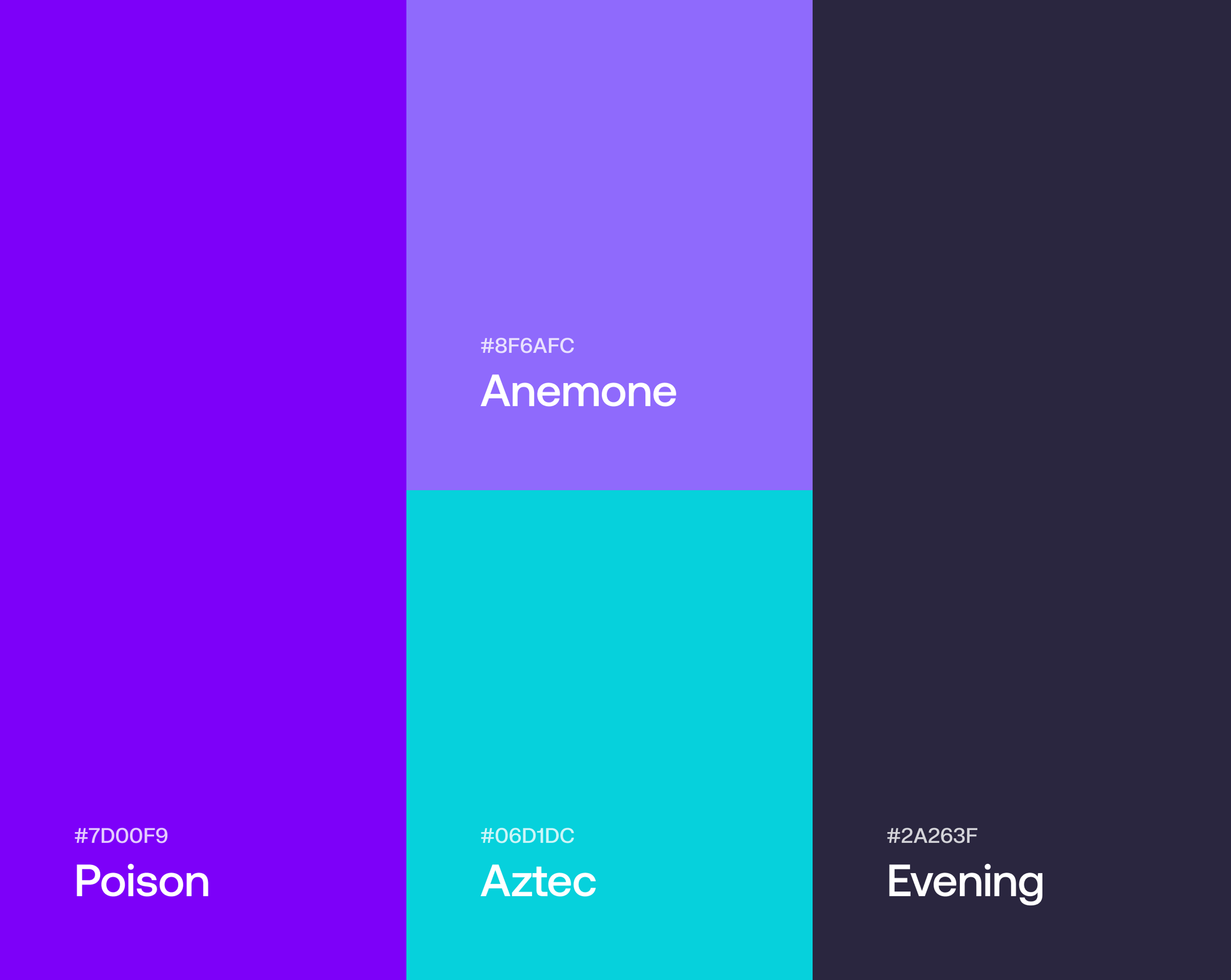
Beyond that, we were tasked to properly communicate their brand and values through a coherent design. With a color palette that, above all else, communicates clarity and trustworthiness, and a comprehensive, user-friendly design, we set out to build a platform that’ll make the user feel right at home.
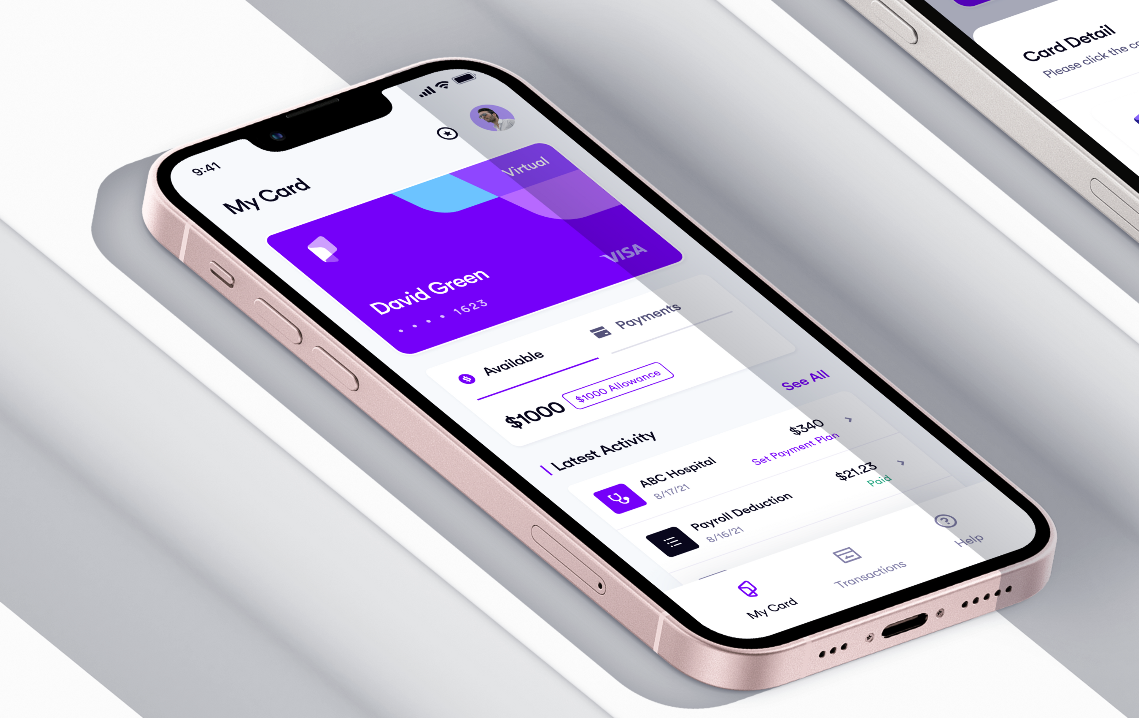
The new mobile application
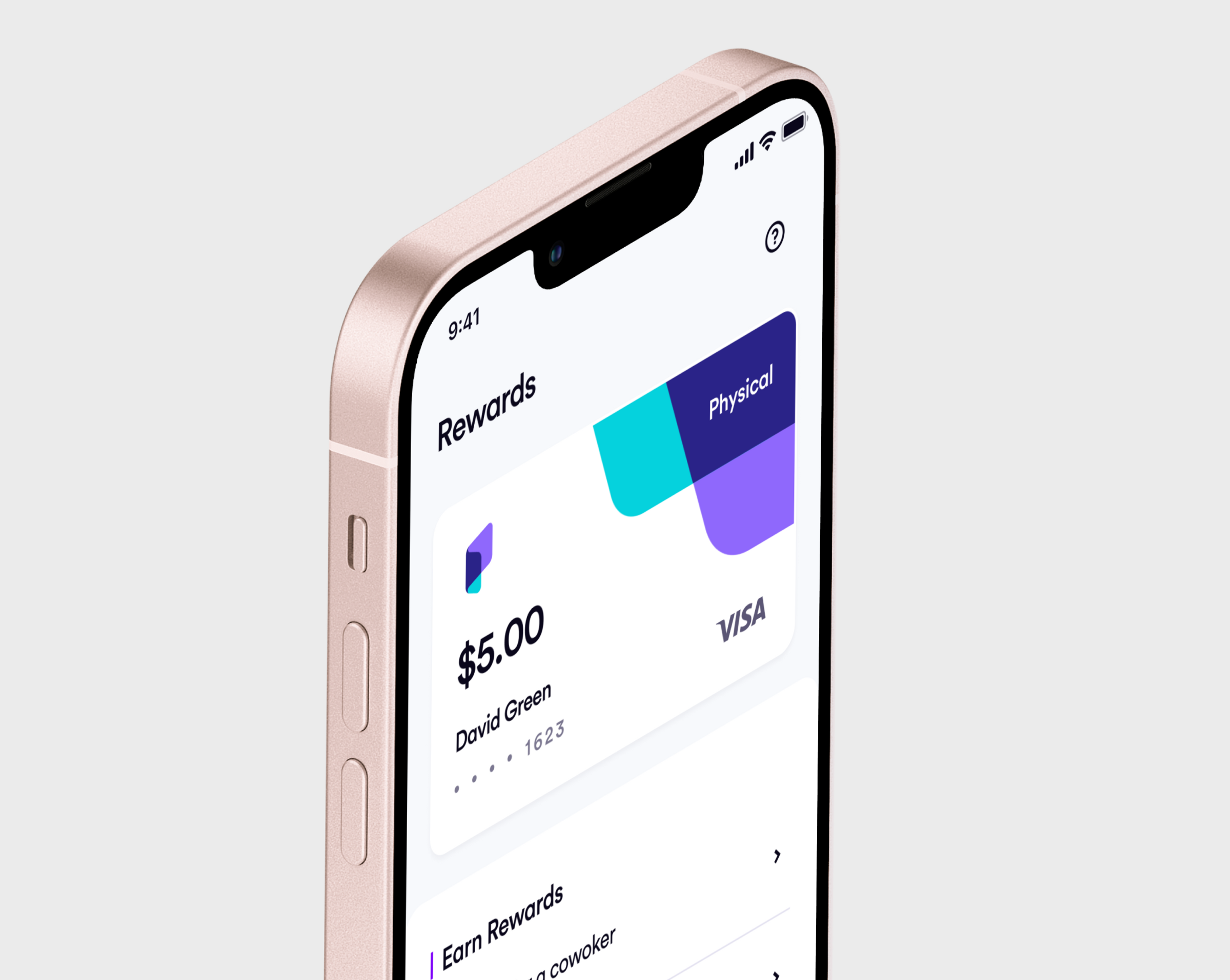
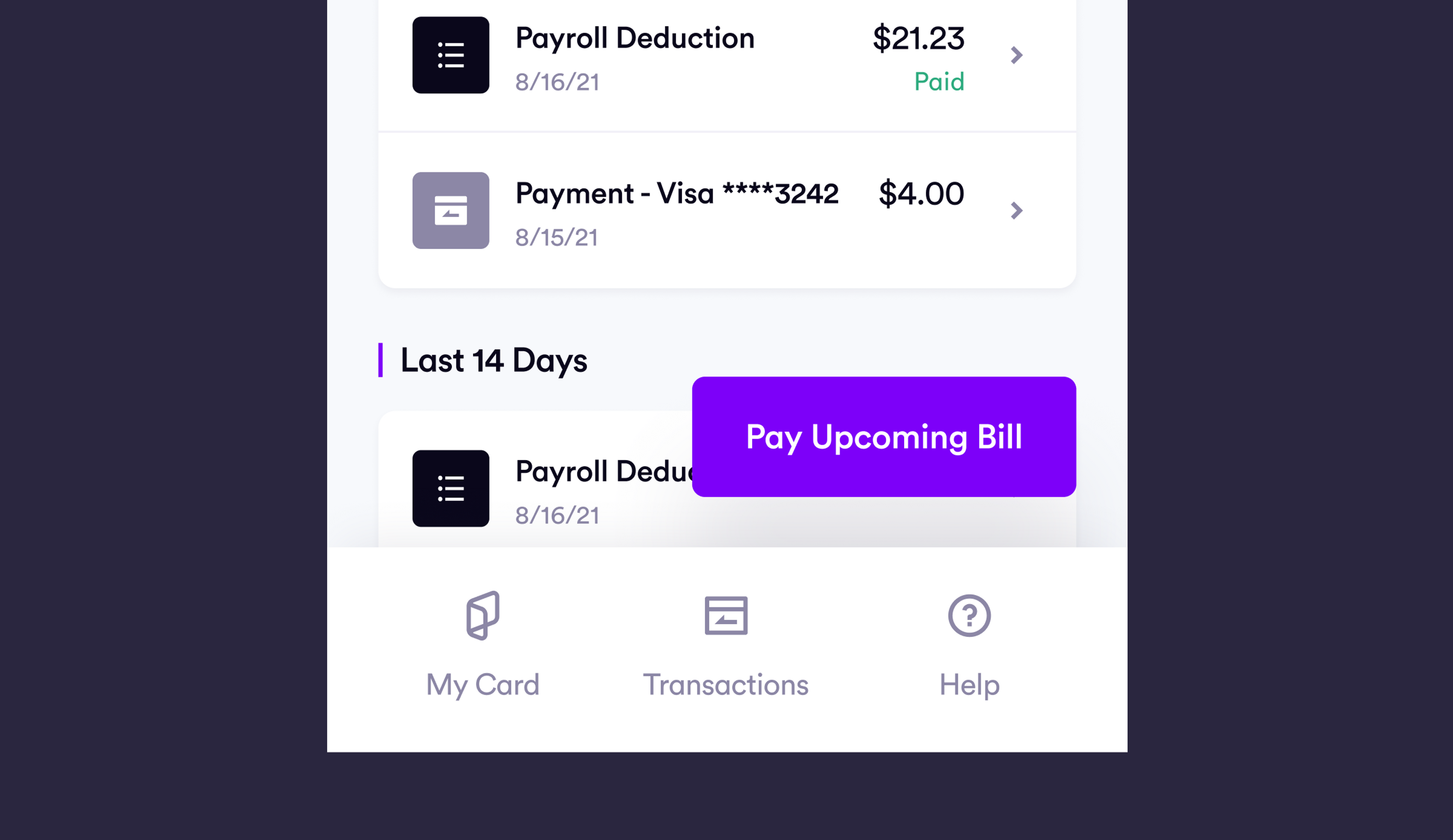
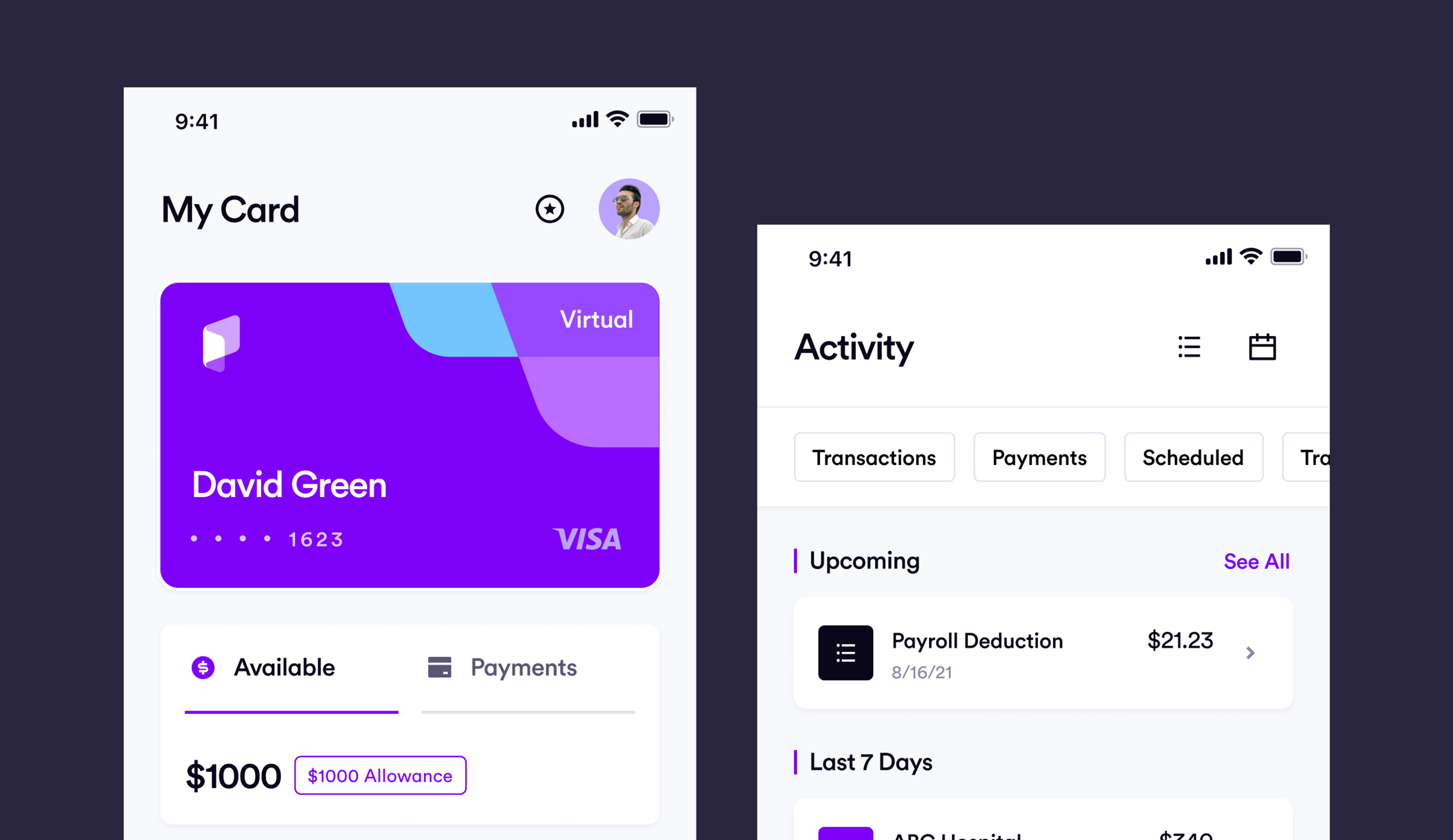
Paytient’s app is the company’s most important touchpoint, and it needed to do a better job of establishing the brand and communicating its values. That’s why we have analyzed customer needs thoroughly to come up with a design that builds trust and confidence fast.
Our redesign placed people at the heart of the experience in order to strengthen Paytient’s goal to be a human-centered payment platform for medical expenses that customers can trust and believe in.
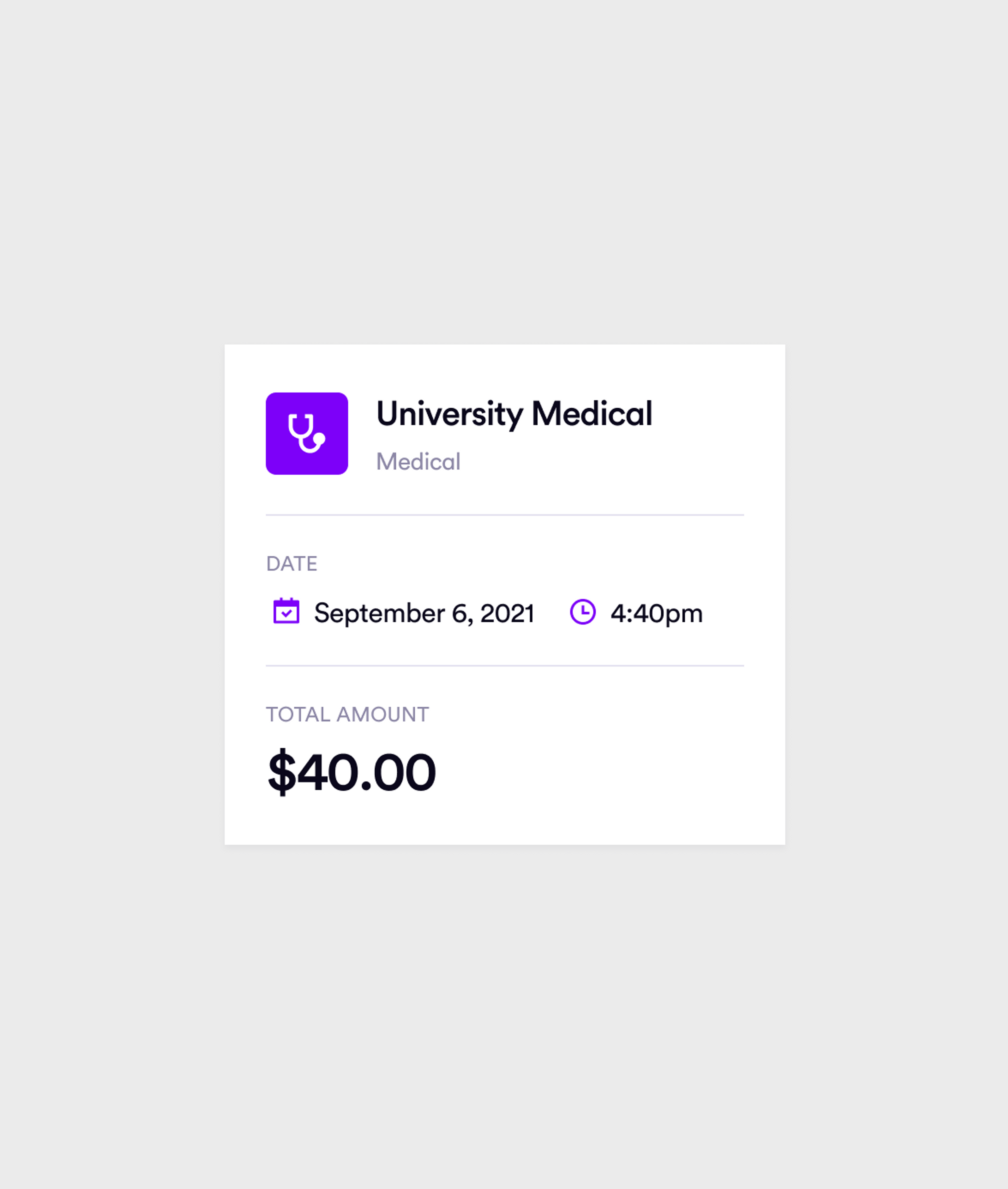
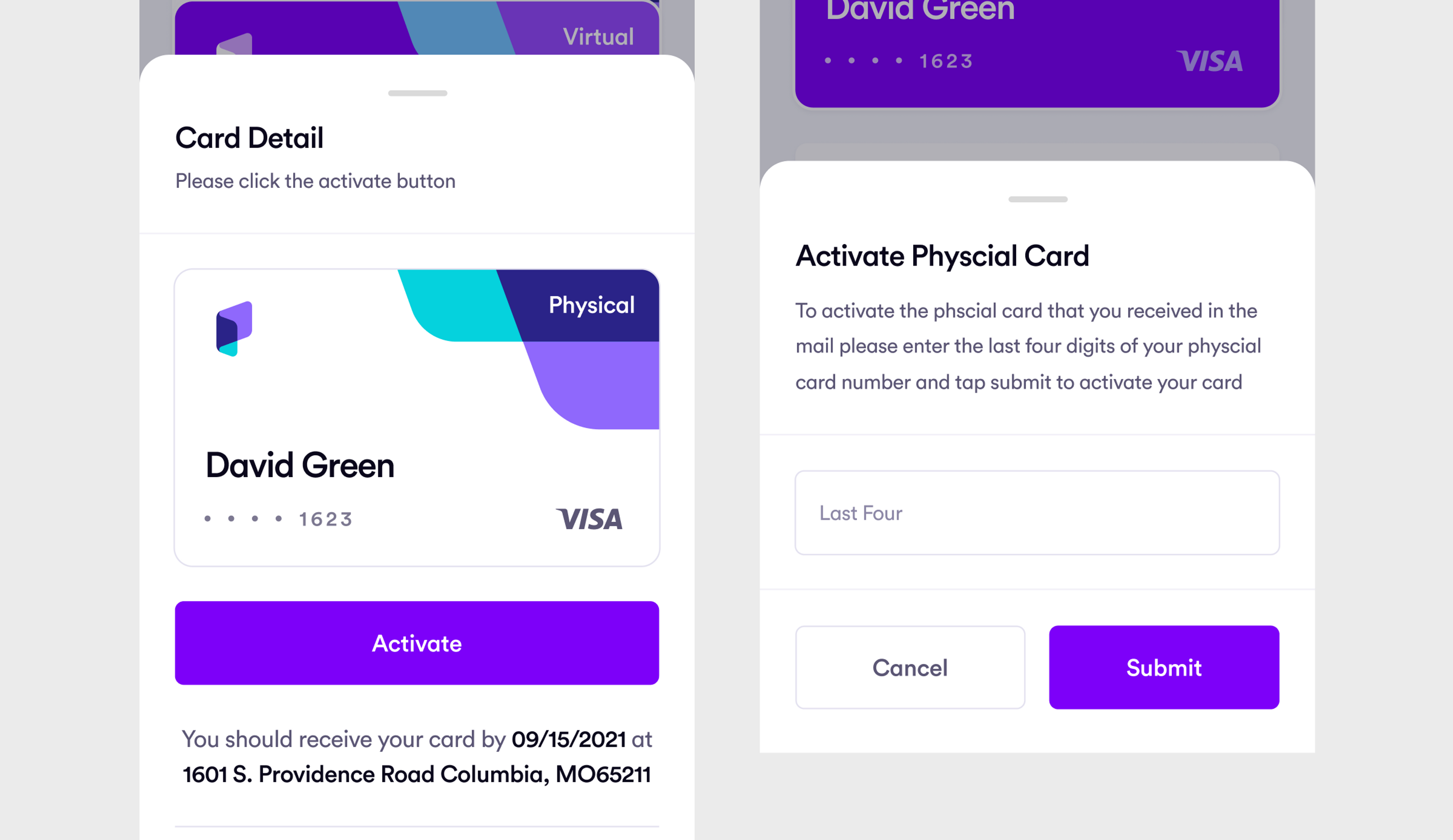
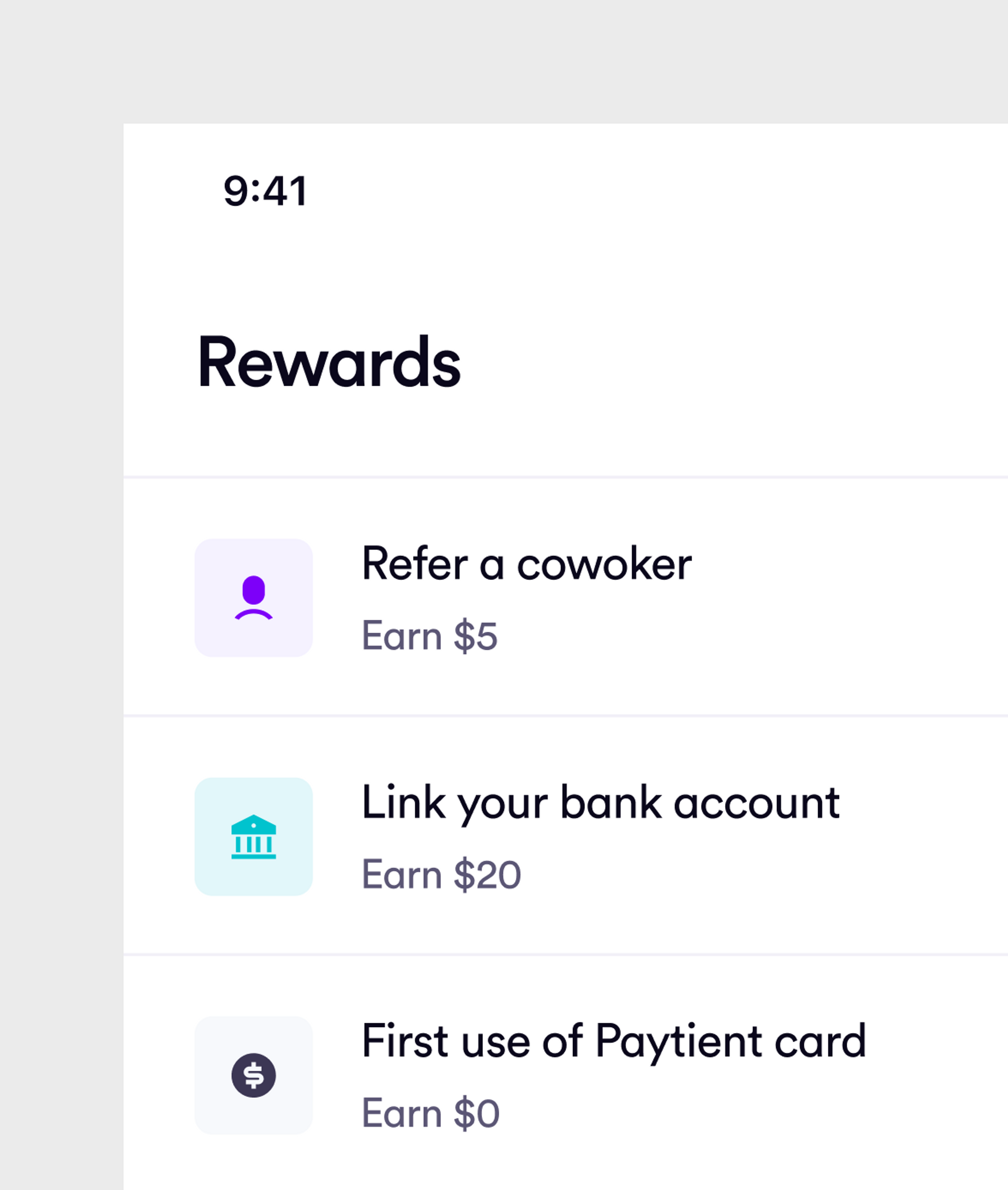
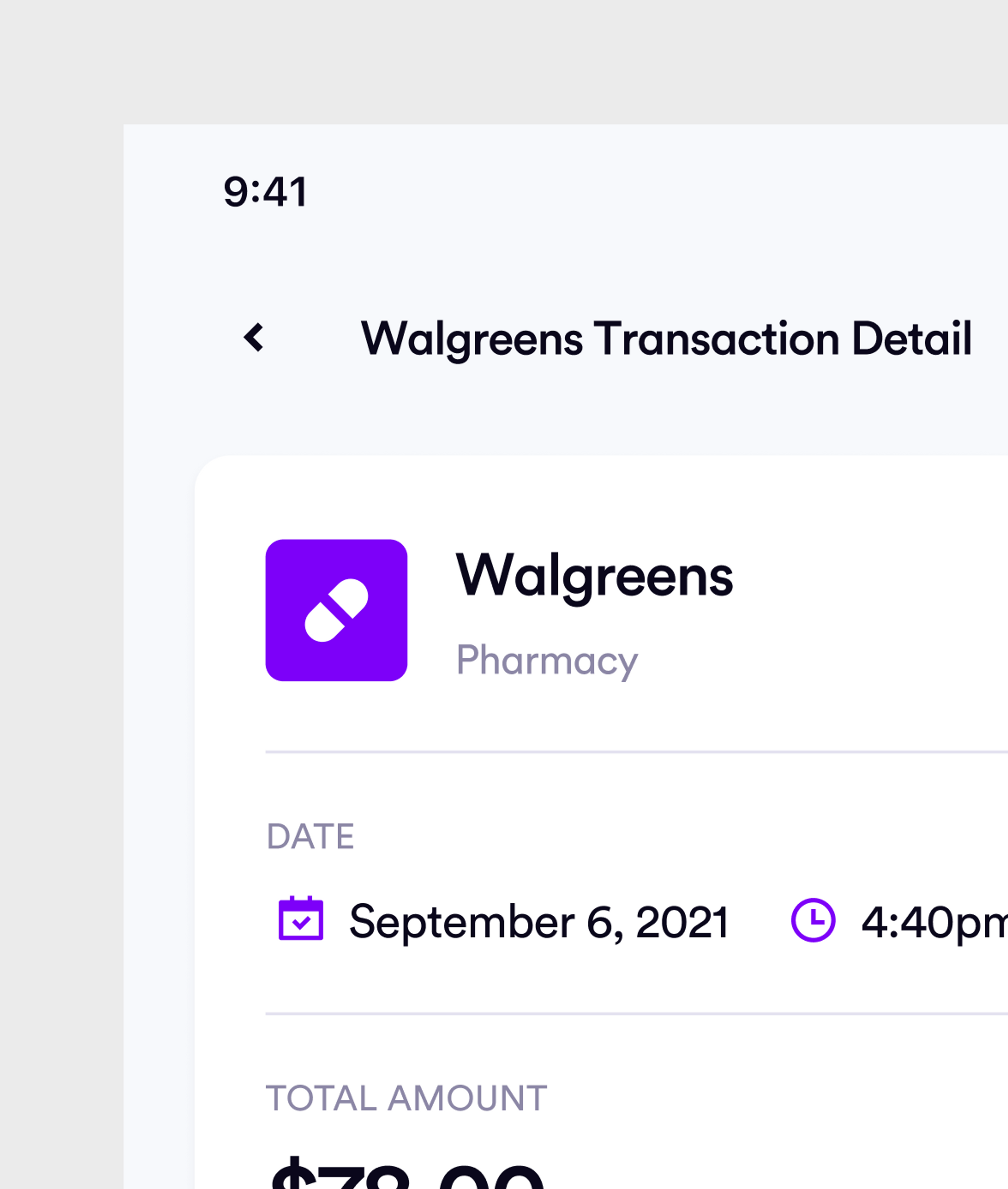
For the transaction processes, we implemented bottom sheets that give the user a clear overview of every step they take. A clear and consistent guidance will familiarize them with the app in a smooth and efficient way - being a health app, it was of utmost importance that we provided smooth and transparent processes that explain the actions the user may take.
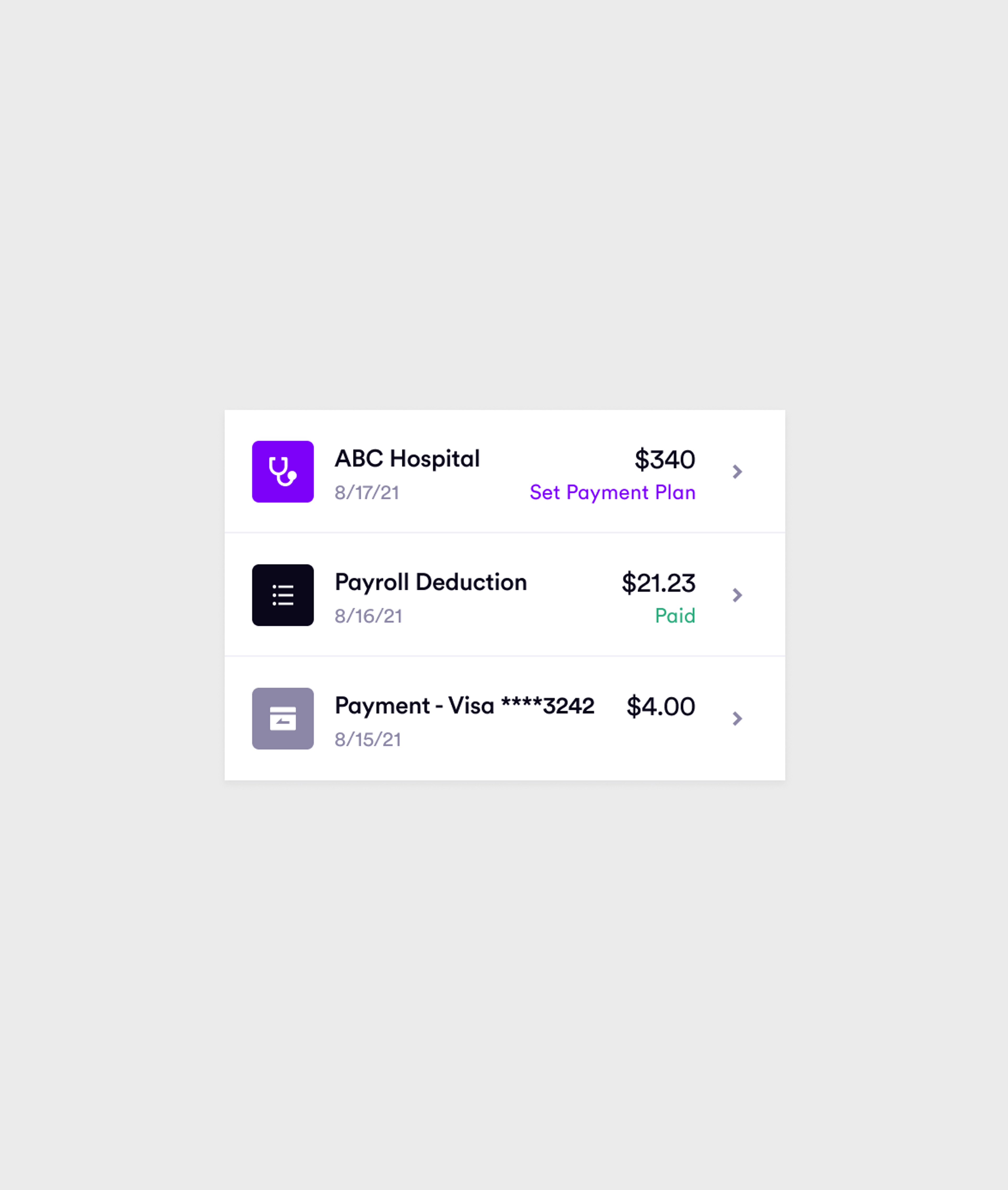
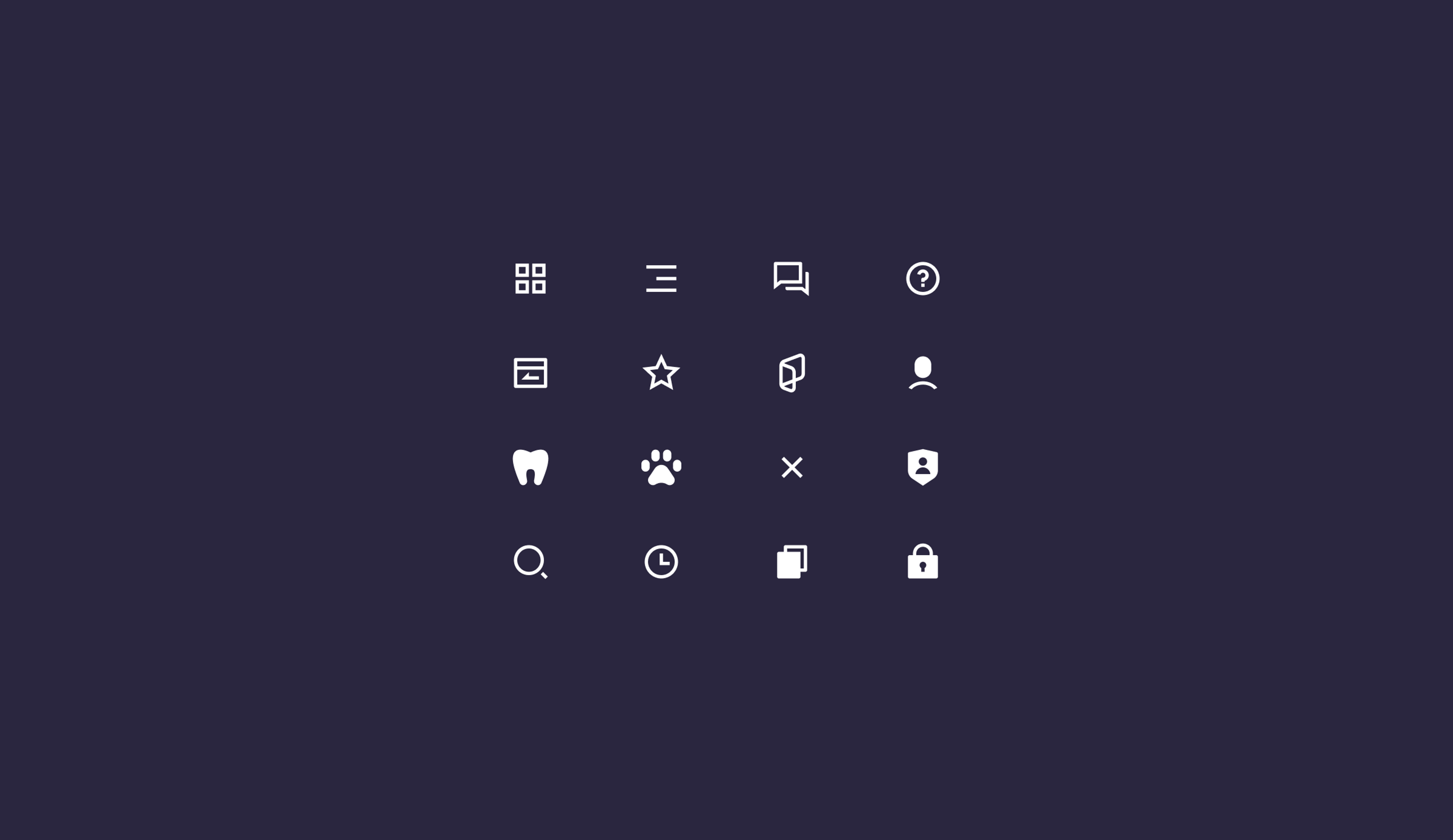
In order to seamlessly introduce the user to all of the app’s features, we created a set of bespoke icons that properly convey the meaning behind every function - without the need for thorough explanations.
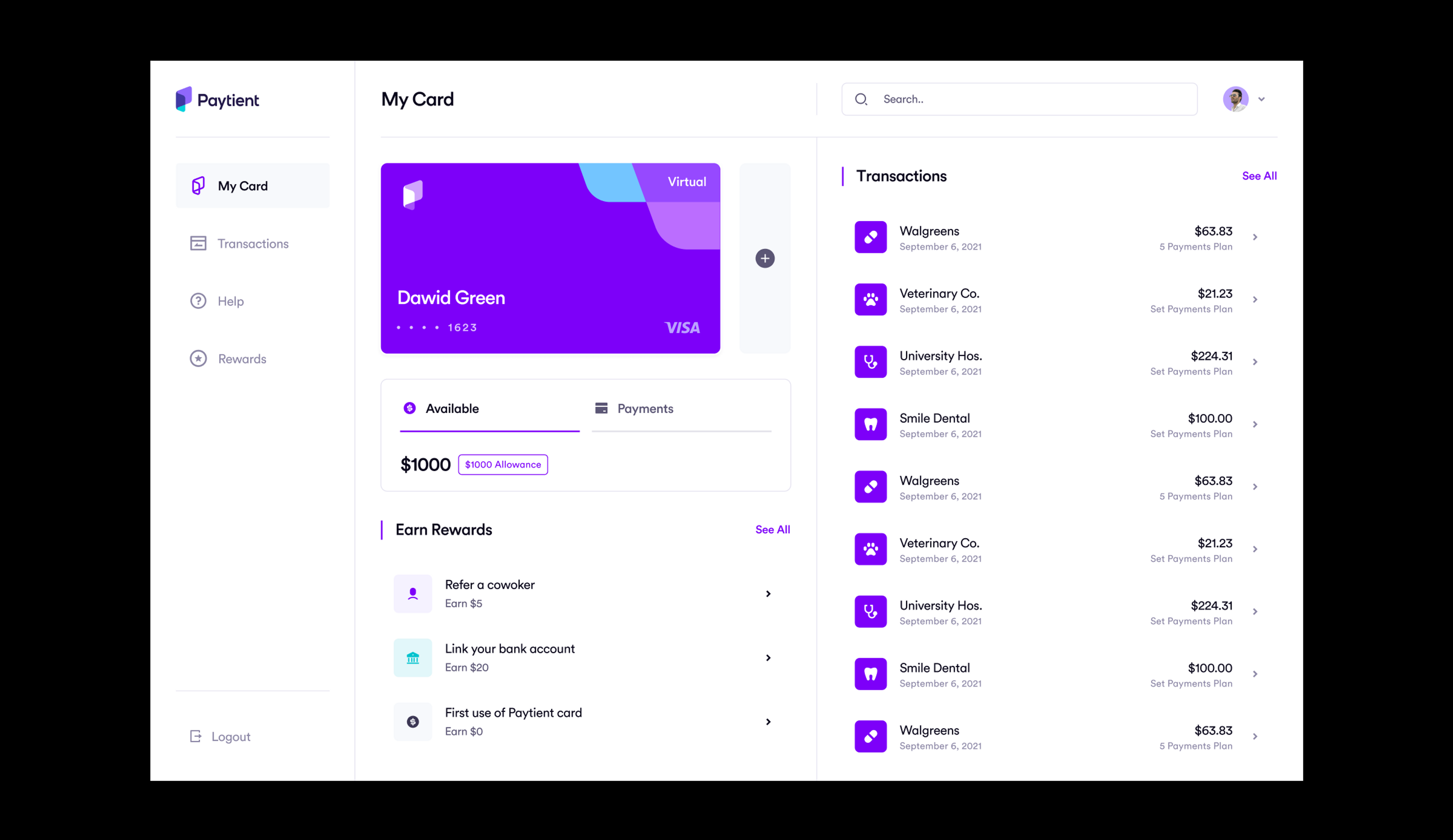
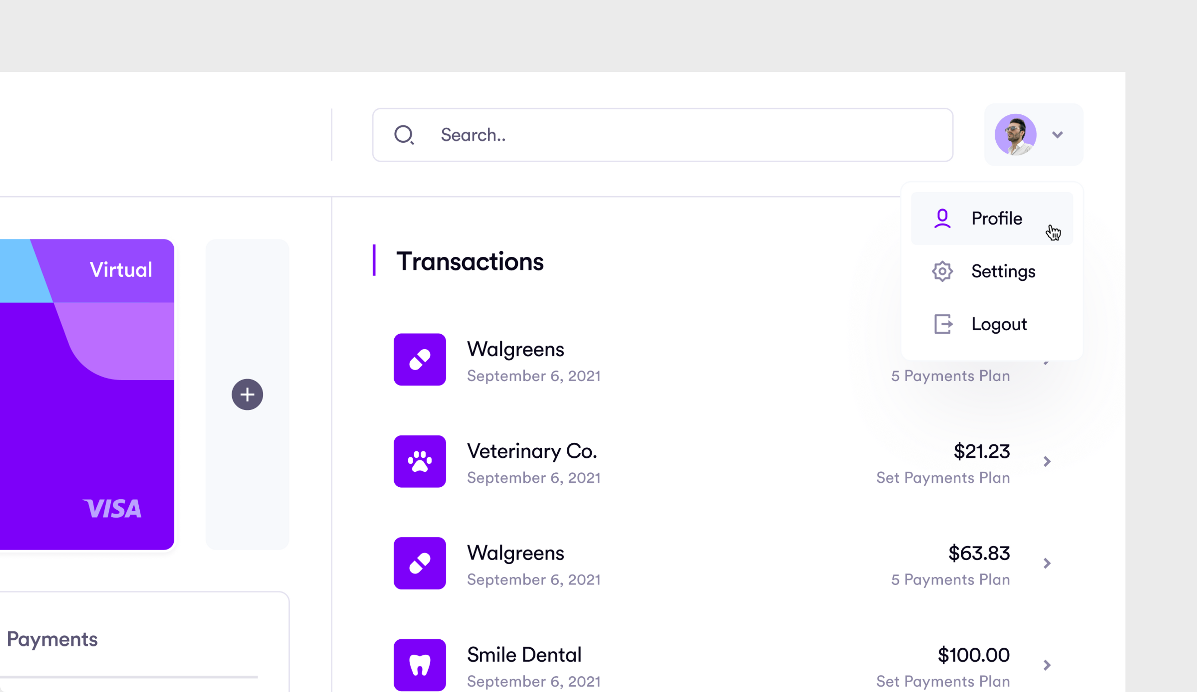
Desktop Application
Summing Up
After 5 months of close collaboration, we designed the new platforms of Paytient. It definitely was a unique challenge to redesign the application to fit exactly the needs of the target group. A sensitive approach was needed to make Paytient as familiar and trustworthy as possible.
Yet, we succeeded in designing a stress-free user journey and communicated a brand identity that builds trust. We went through each phase of the design process with one goal in mind: improving the patient experience every step of the way.
