Skylight Homes
Helping Skylight on a mission to provide a seamless rental experience for tenants from search to move-in.
Skylight Homes is a technology-enabled marketing and leasing platform that makes it simpler for multifamily owners find the perfect tenant for their vacancy.
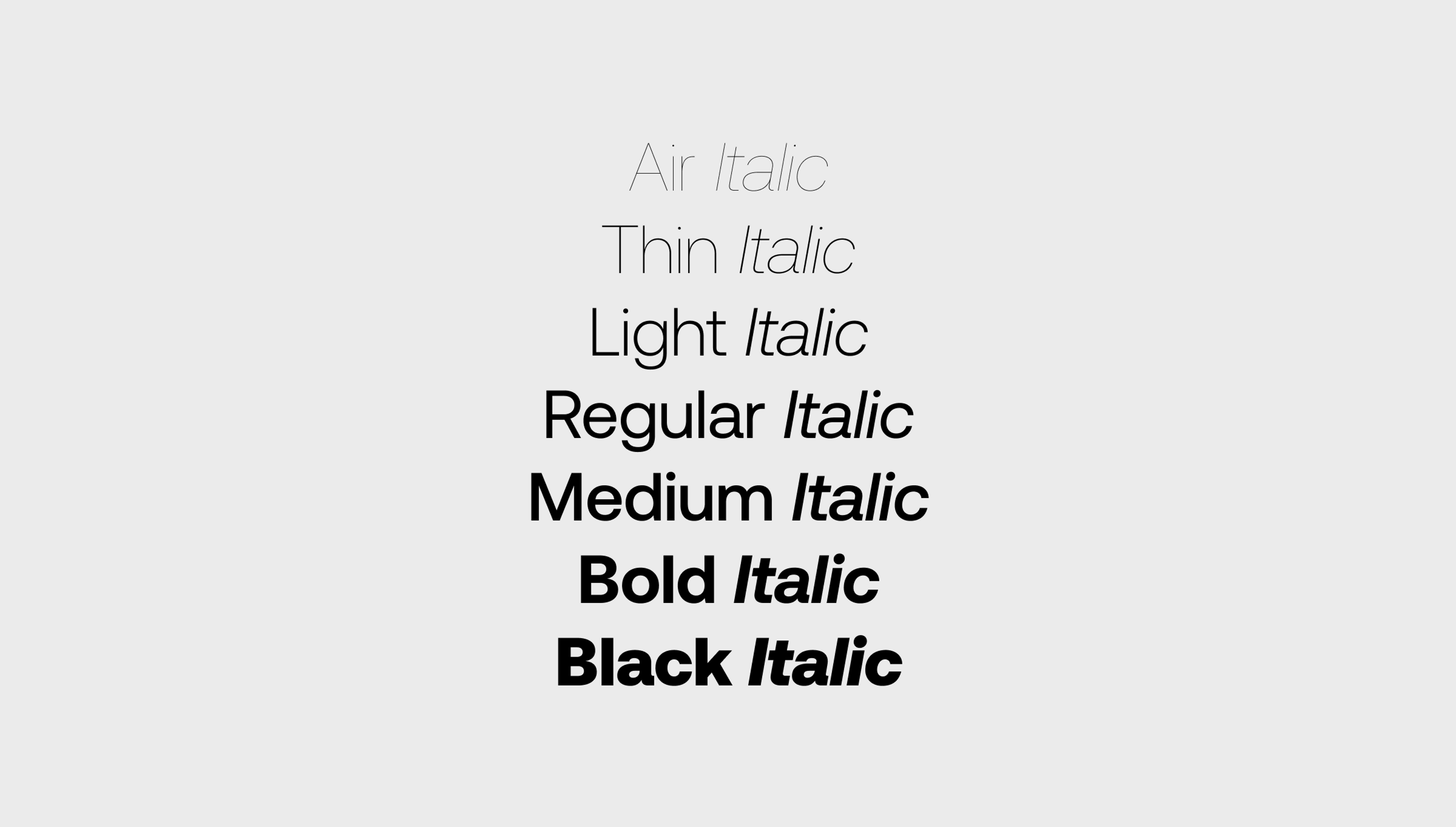
We re-designed Skylight's whole desktop/mobile product which includes design language, branding, web app & responsive app as well as an entire design system. During the project period, the client worked side-by-side with us and contributed to the creation of the new designs and user flows.
- Product Workshop
- Market Research
- Analyze Customer Needs
- Product Definition
- Brand Strategy
- Product Design
- Responsive Product Design
- Motion Design
- Design System
- Development Handover
A brand that lasts
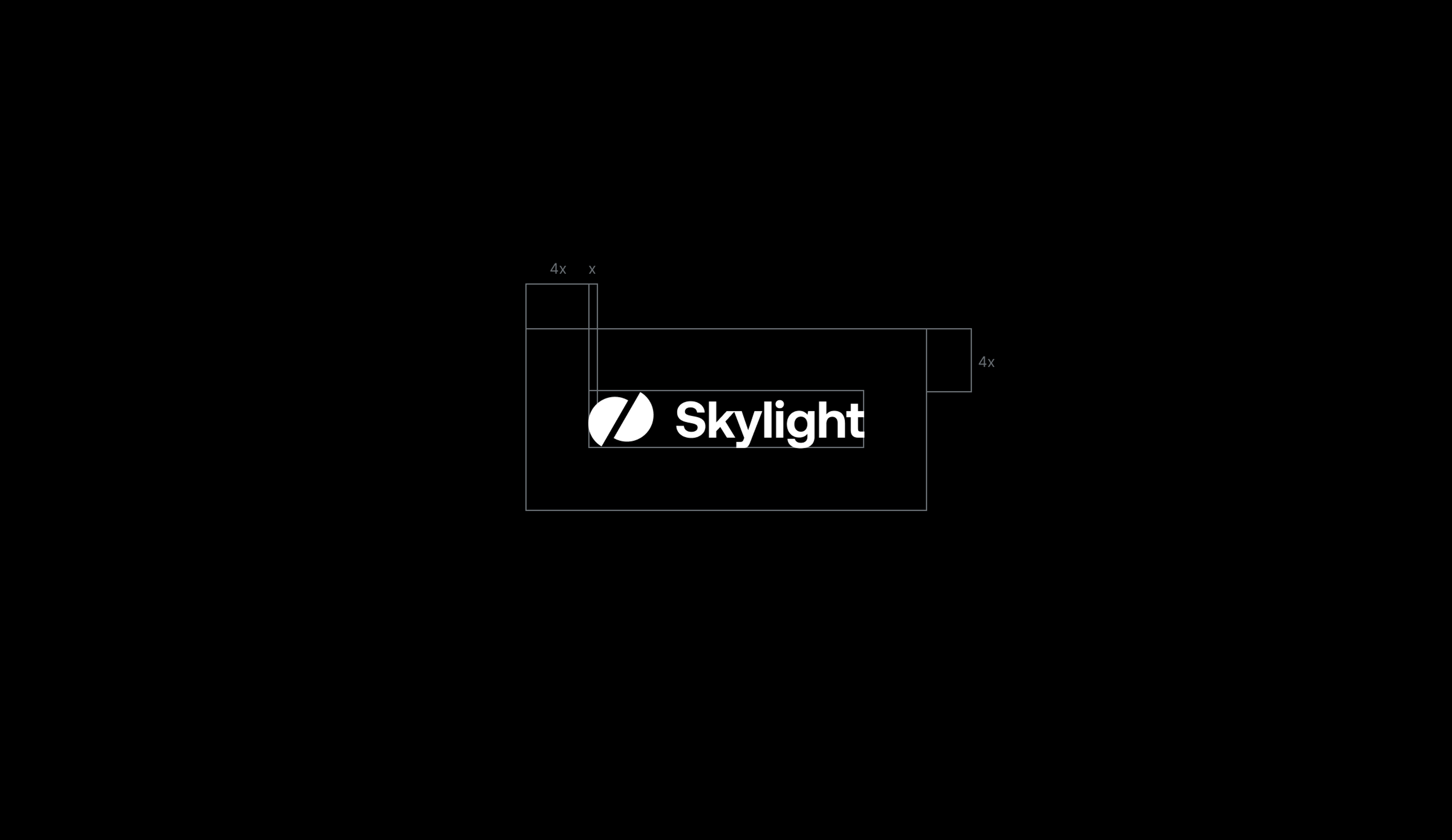
Renovating brand and design
We were tasked to completely overhaul Skylight’s brand identity, create a new design language for their product suite, update their product design and UI/UX design, and create a new responsive design for their web/mobile platforms.
So basically, we had a project of great extent in our hands, which required elaborate planning, communication, and teamwork.
That’s why we decided to visit our clients in L.A. and hold an extensive workshop, discussing ideas, approaches, and designs with them. The workshop included a discovery phase, where we have talked about the user flows of the platform and presented ideas from our side based on knowledge gained in previous projects.
During the entire project period, the client worked with us side-by-side, and thus contributed to the creation of the new designs and user flows. We love to build partnerships with our clients where ideas are mutually appreciated and discussed. That’s how the best projects are made.
Insights you can use
The Process
We started the process by conducting market research to analyze Skylight’s competitors and their target audiences. The initial research helped us especially during the early conceptualization of the new brand and visual identity of Skylight - a crucial step when conducting a full rebrand and redesign of the product and platform.
Skylight Homes aims to transform the leasing and rental market by combining an exclusive network of residential agents with tour logistics technology to enable owners to quickly scale leasing teams, maximize occupancy, and streamline operations. The company provides marketing, leasing, and analytics services to its clients on a highly professional level.
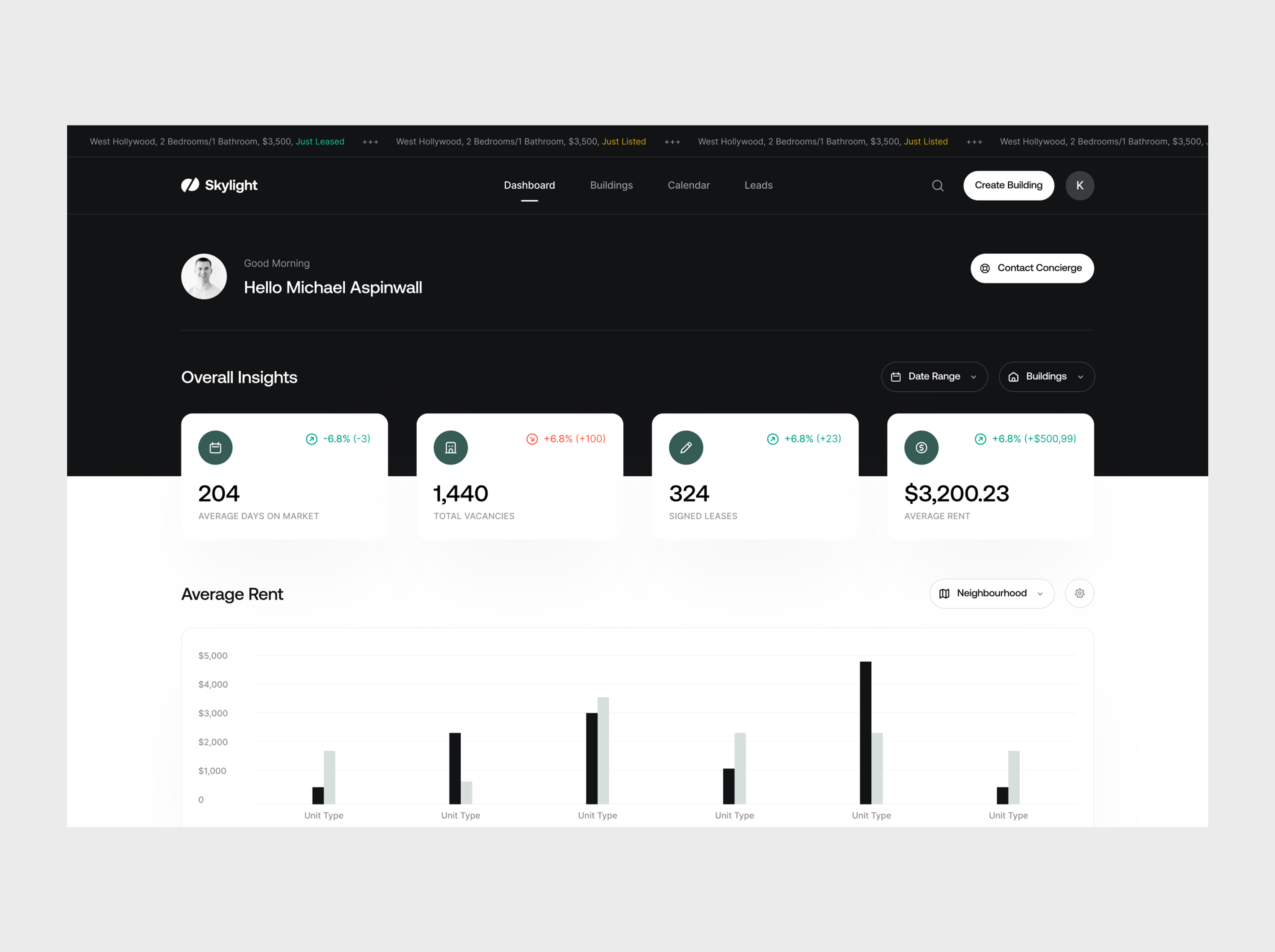
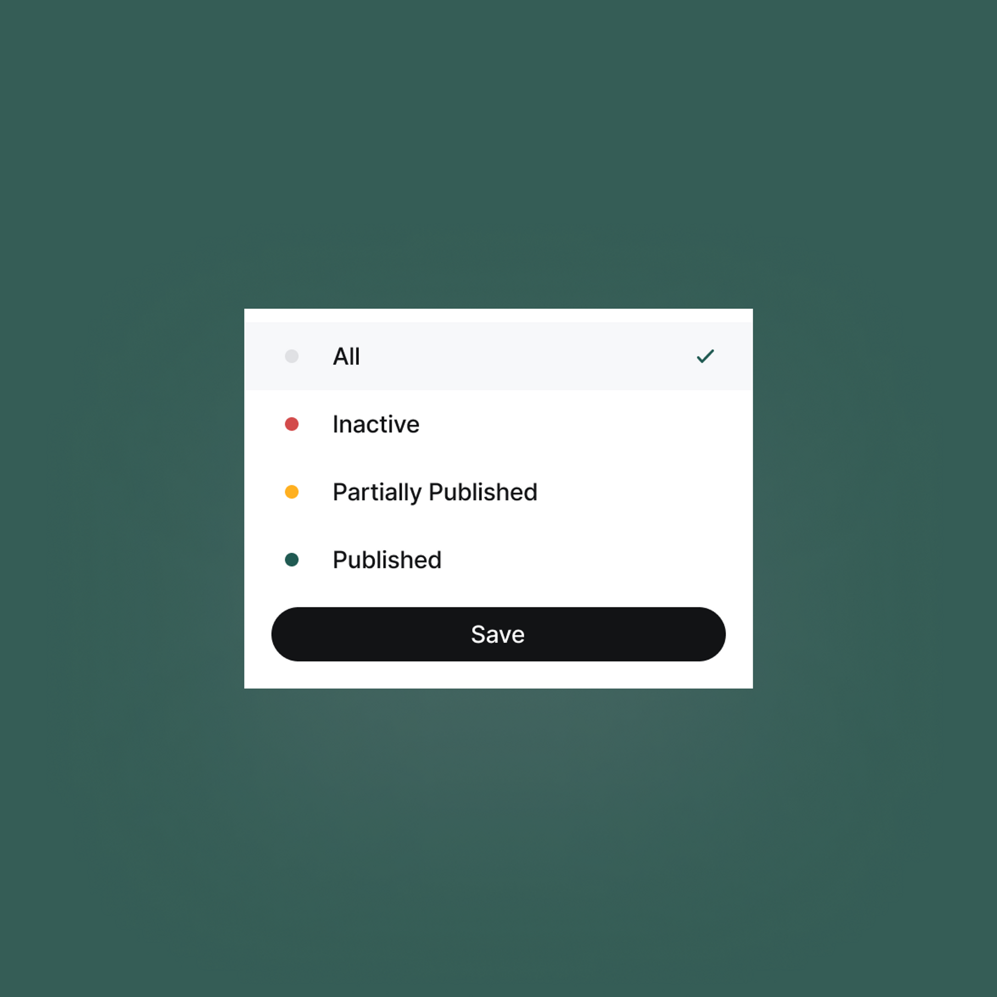
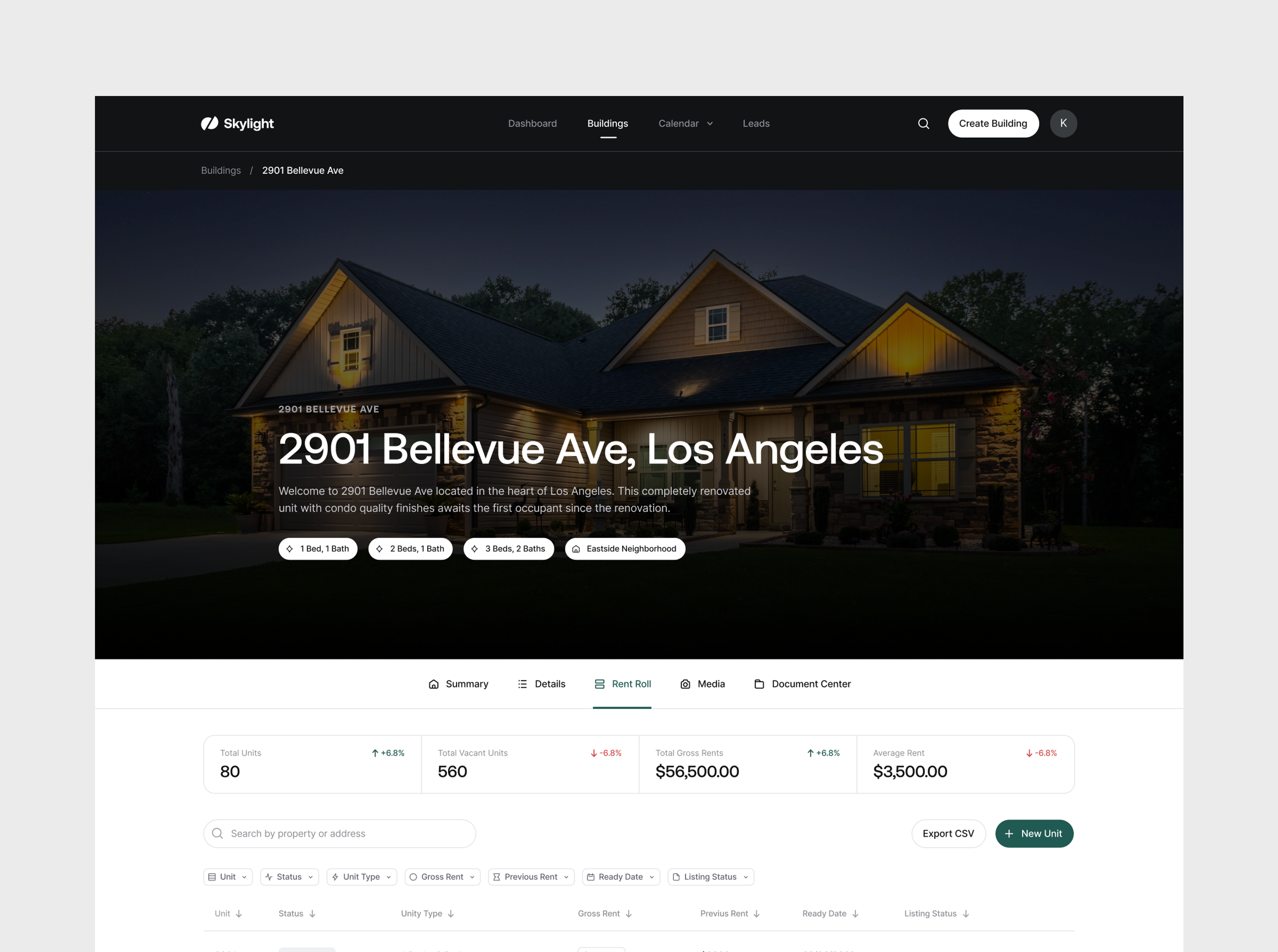
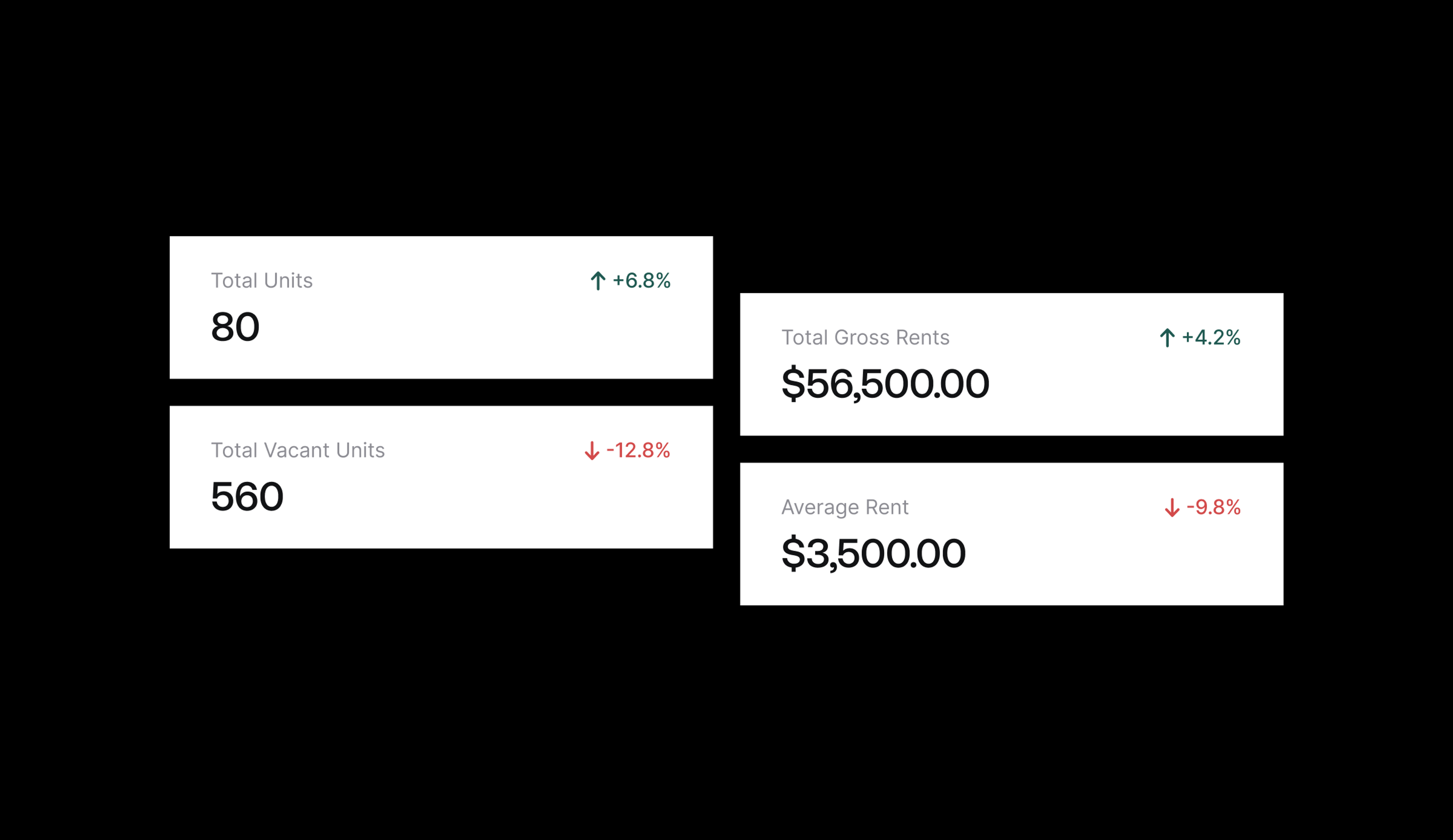
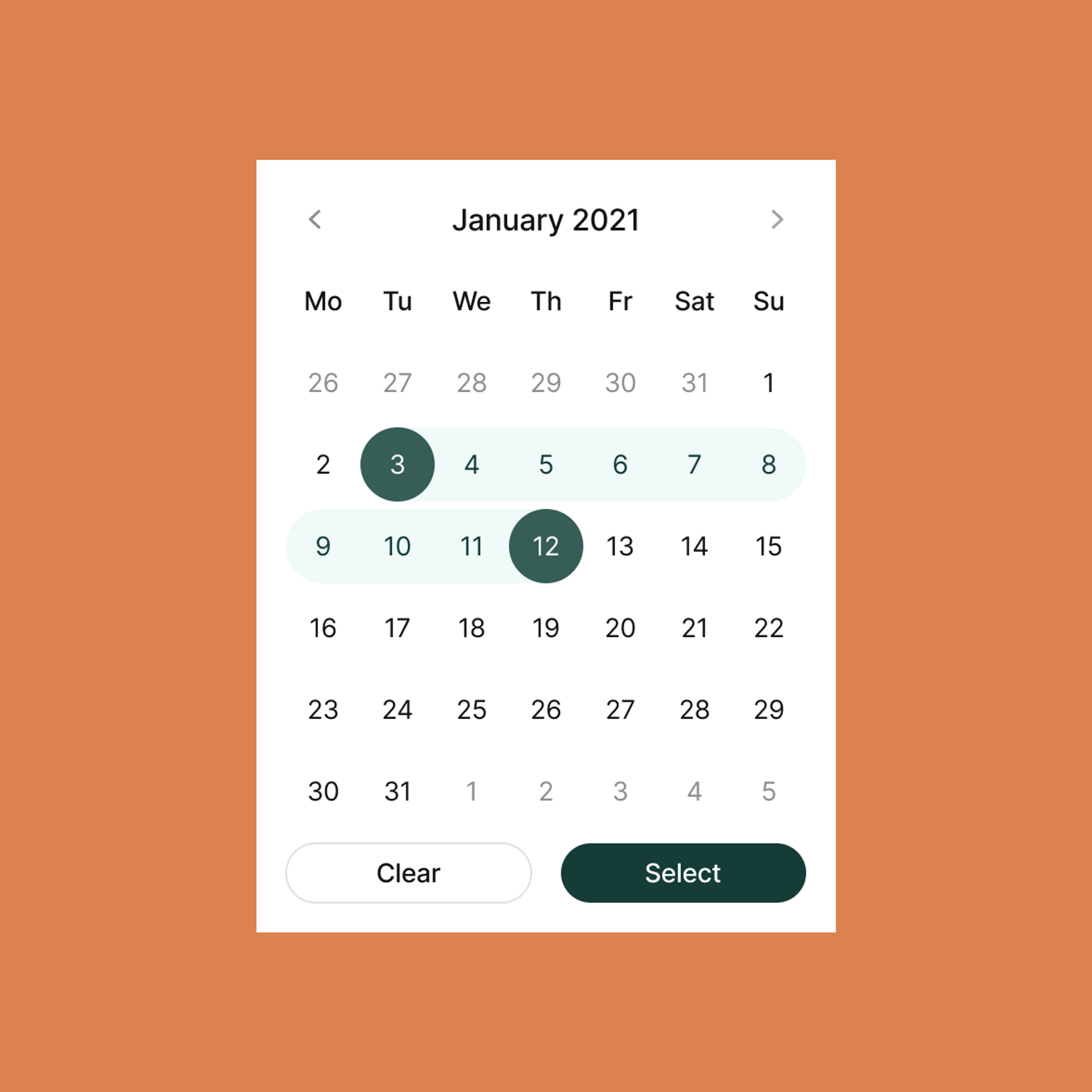
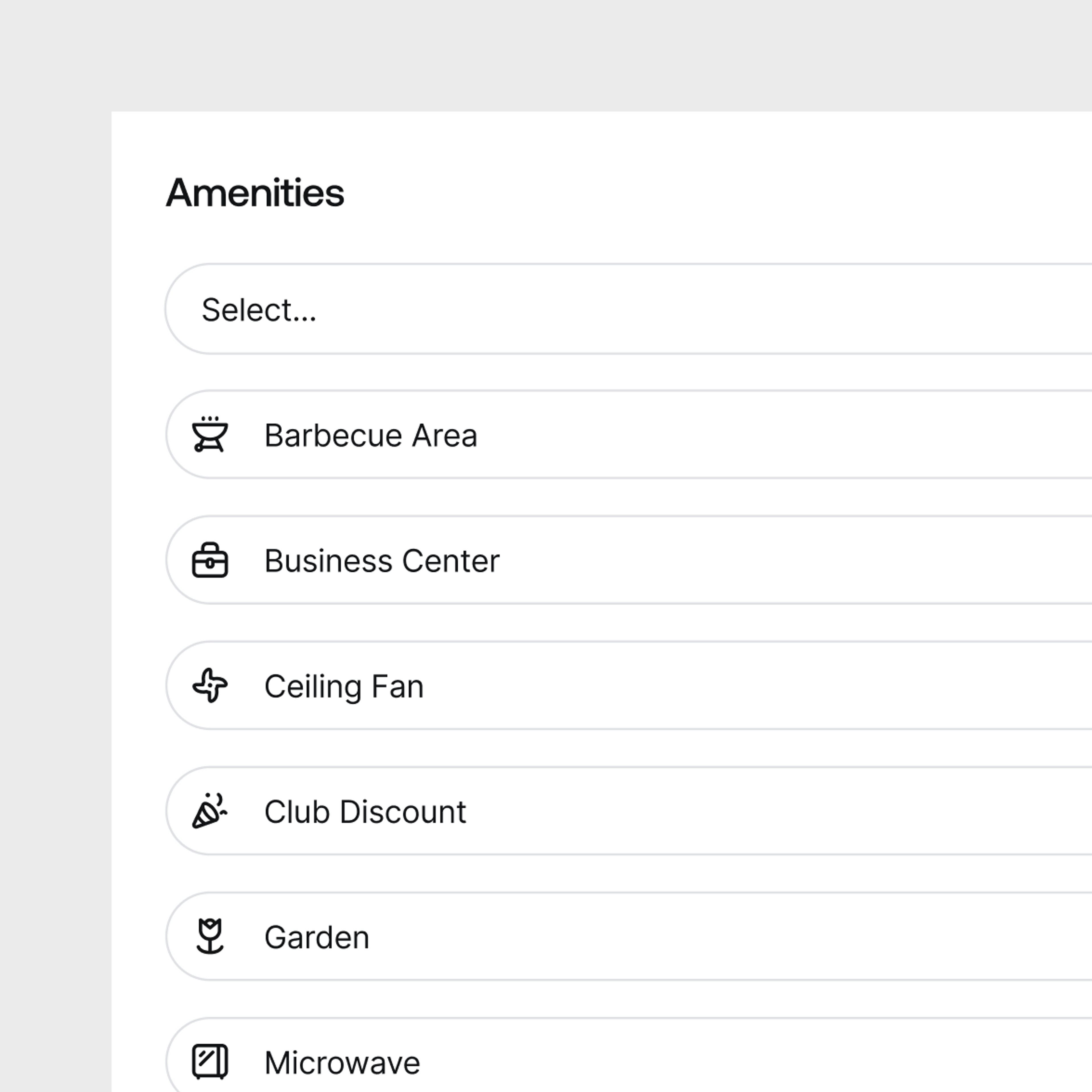
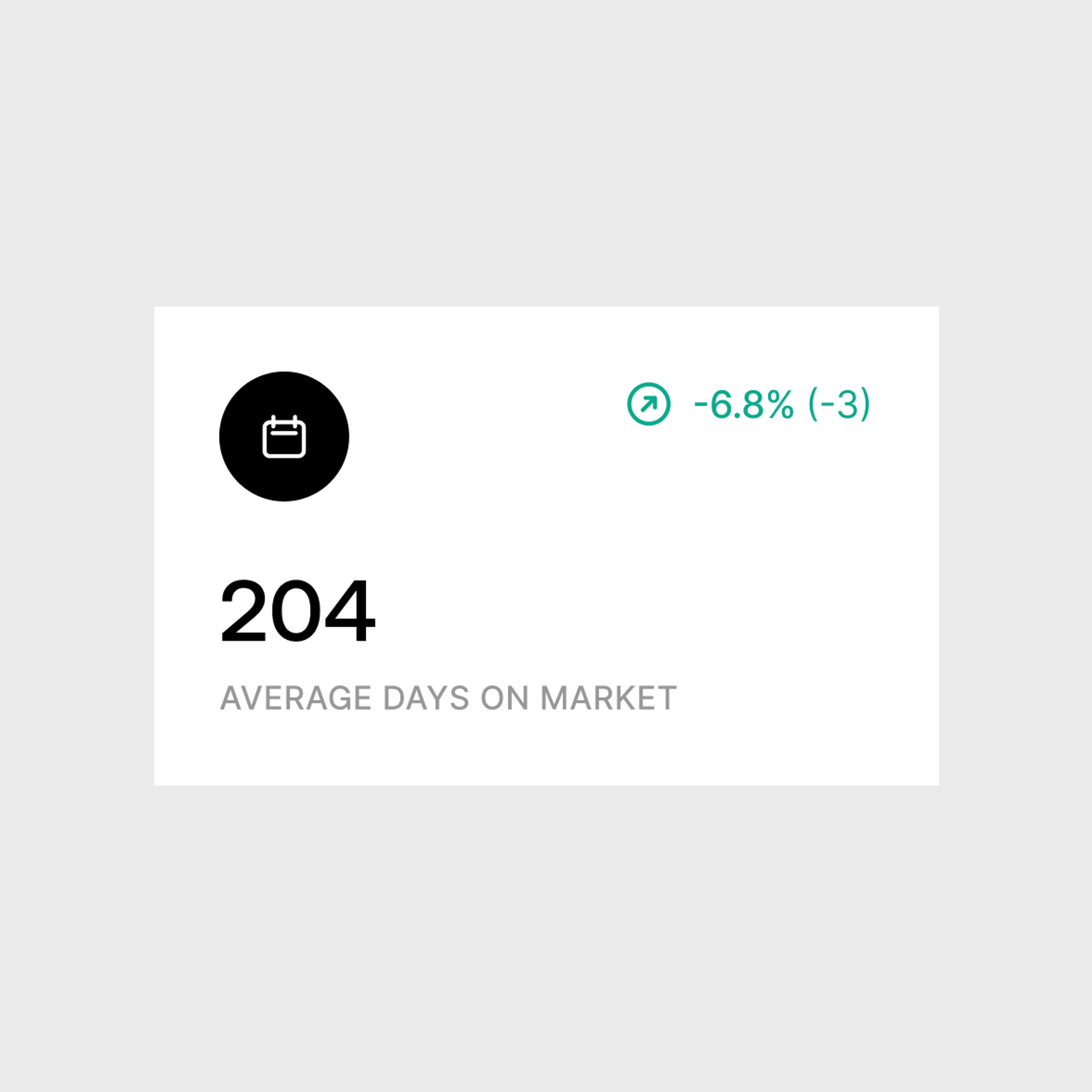
This is their mission - meanwhile, our mission was to properly communicate their services and values through coherent design and an outstanding brand identity. Our prior research equipped us with the necessary data and knowledge to come up with a solution that is tailored to our client’s needs. We designed a clean user interface that guarantees a smooth user journey, and displays data and insights in a clear and aesthetically pleasing manner.
Have it on-the-go
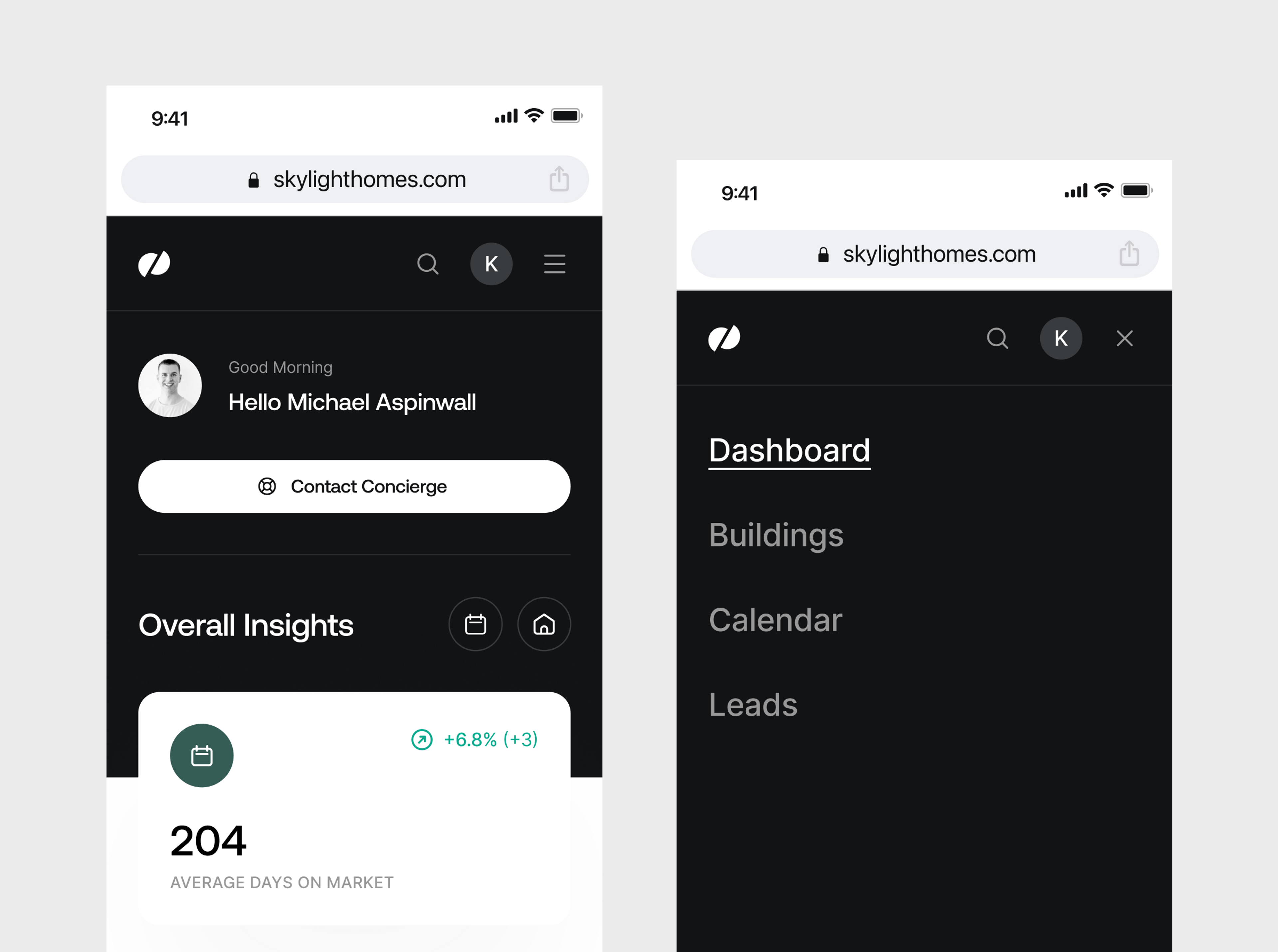
A key part of our work with Skylight Homes involved the design of a responsive web application. Following the principle of „mobile-first“, we created an experience that unites flexibility, efficiency, and aesthetic values.
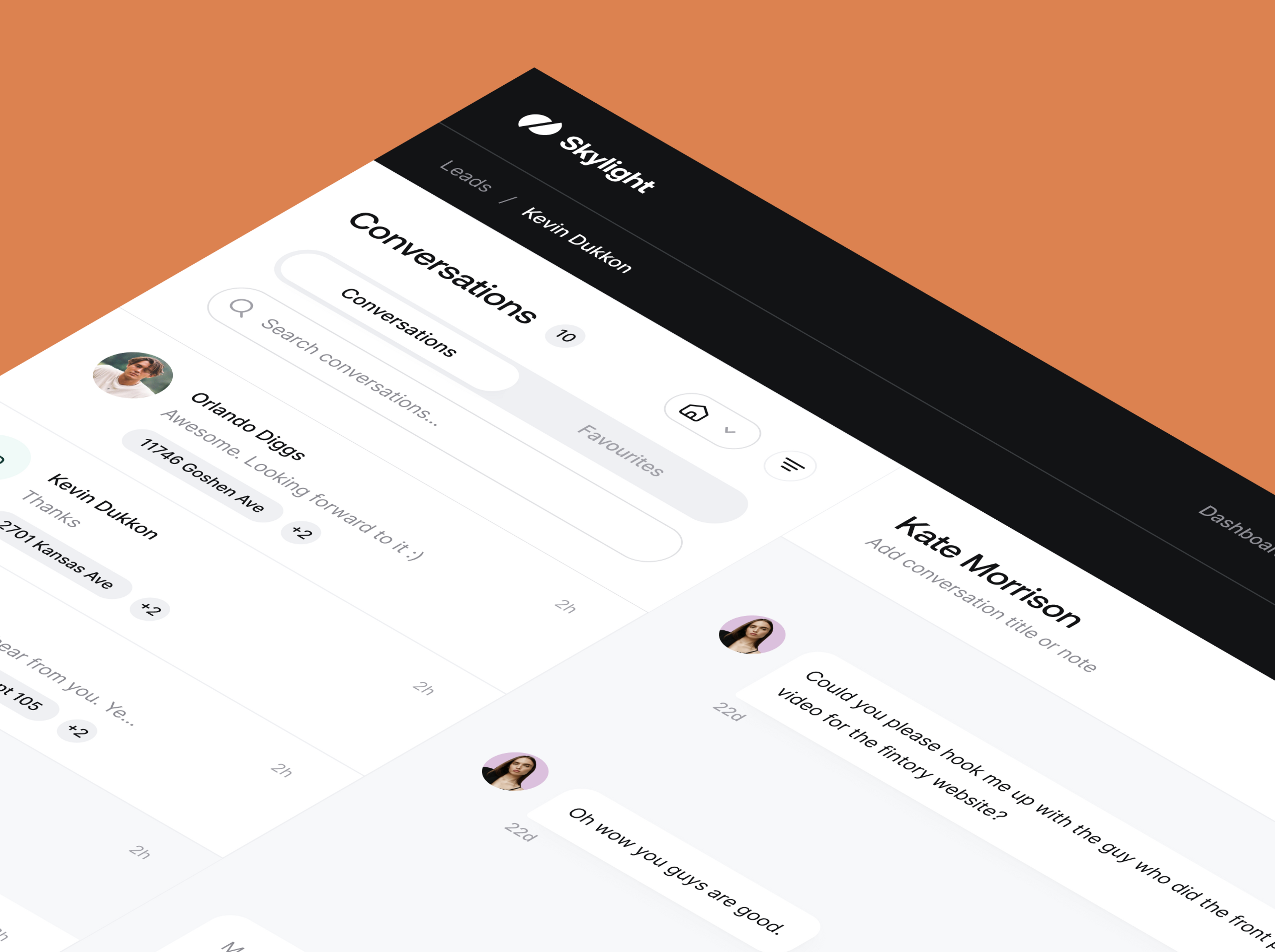
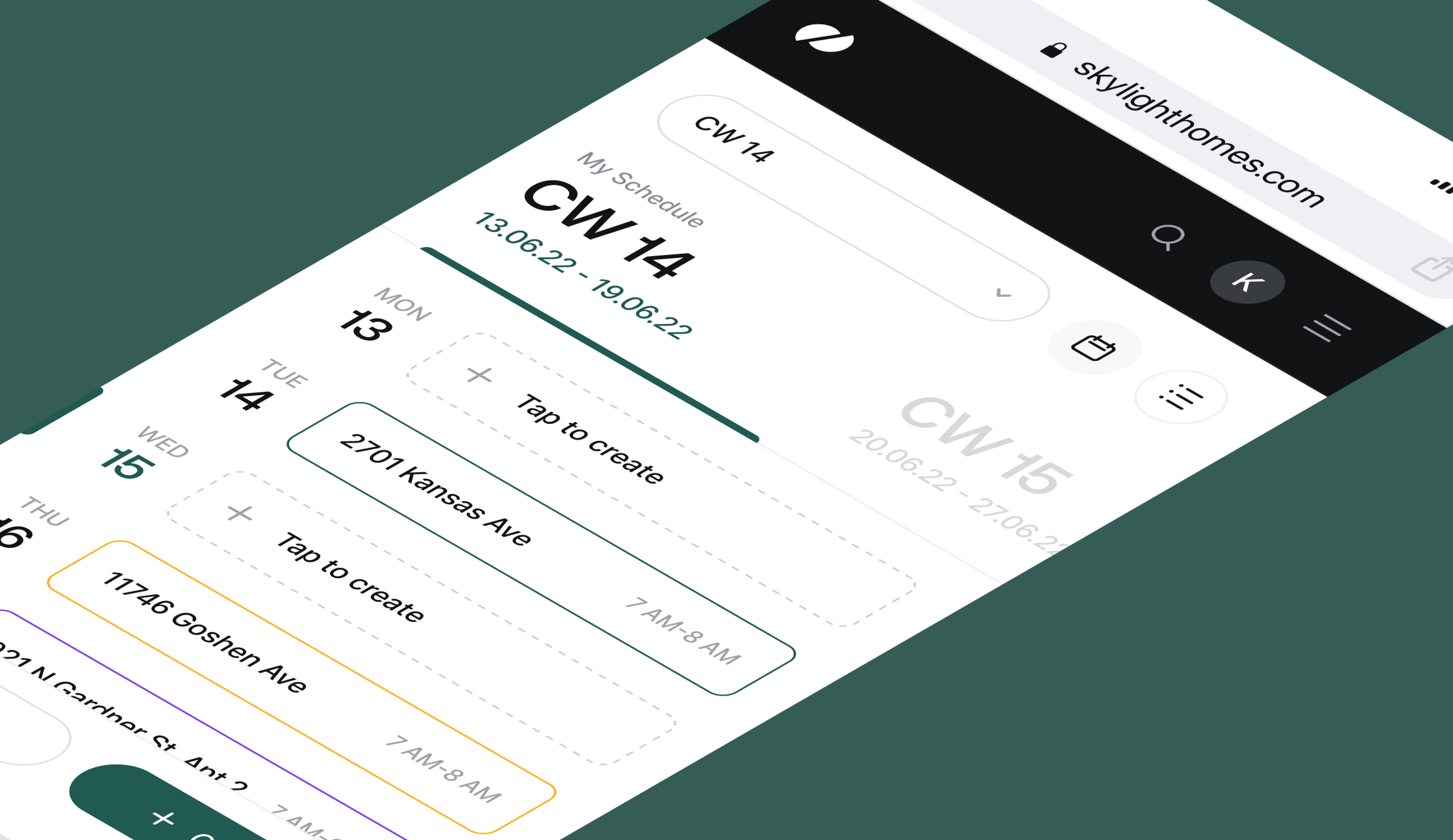
The mobile web app had to display all the information the user would find on the desktop app - the list of buildings, leads, a calendar, and of course your own dashboard - while still maintaining a clear, user-friendly interface. To achieve this, we went for a simple and clean approach that adheres to our sophisticated design standards.
The result: an optimized user experience to have on-the-go.
Summing up
Within 3 months of close collaboration with our clients, we were able to deliver an updated design system that maintains a high standard and a cohesive look across all platforms and the whole product suite. On top of that, the system is highly sustainable. The new responsive design excels at providing a seamless user journey both, at home and on the move. And after an extensive rebrand, our client’s values are properly embedded in their brand identity.
Skylight Homes brings the rental and leasing market to a new level. And we are proud to have contributed to their journey.
