Stocklabs
Trade better using Stocklabs through real-time AI based on market timing algorithms.
Stocklabs offers state of the art next gen mean reversion algorithms and real time AI to assess market direction on a macro and micro level. Users can gather information quickly to make decisive market trades.
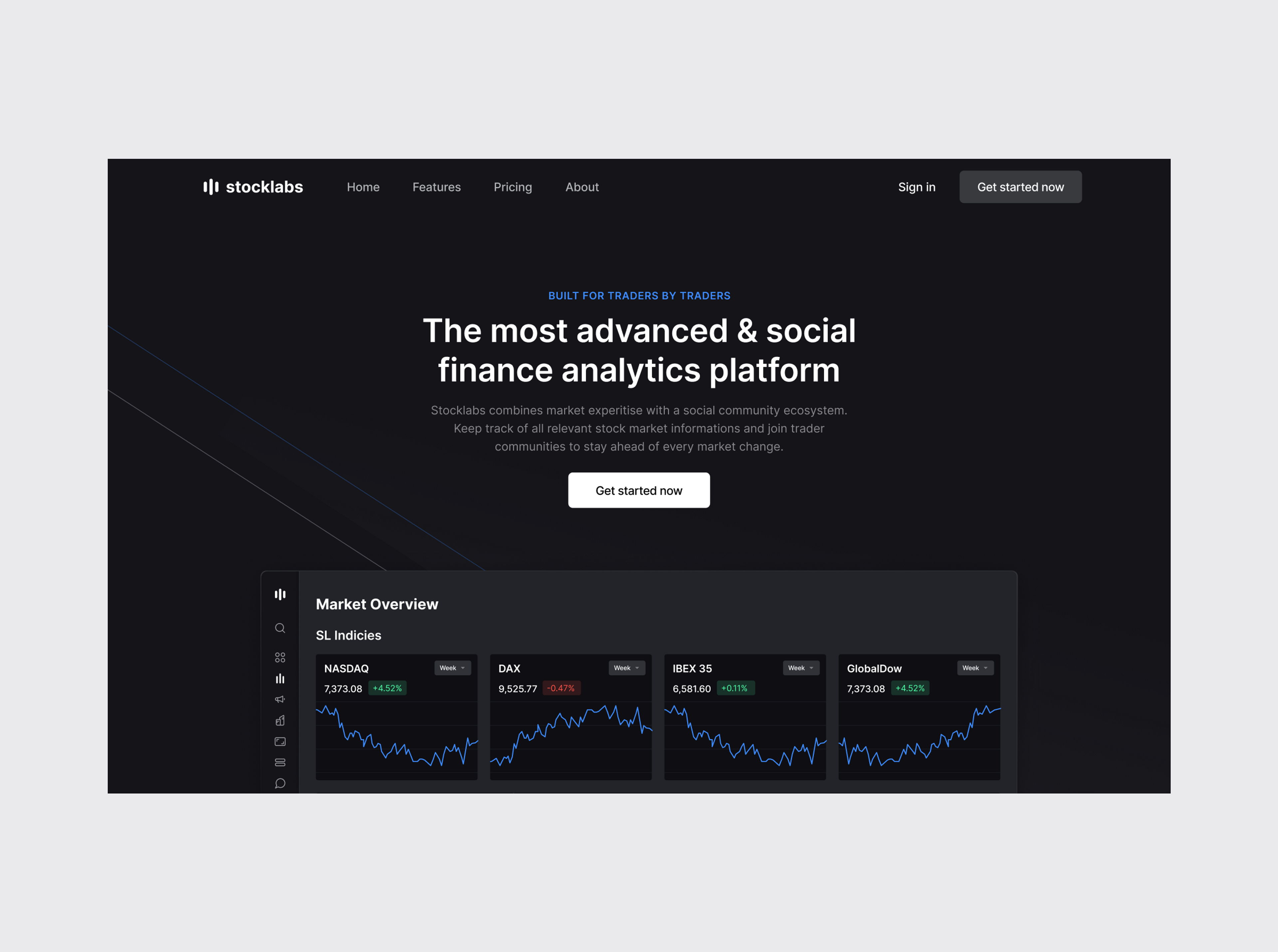
Stocklabs is the most advanced finance analytics platform on the market. Founded over 10 years ago it has a proprietary Overbought/Oversold system, real-time data calculation and many metrics suitable for both intraday traders as well as longterm investors seeking an edge in the market. Built for traders by traders.
- Analytic Driven Iterations
- Market Research
- Product Design
- UI/UX Design
- Web Design
- Responsive Web Design
- Motion Design
- Development Handover
Algorithmic ranking for all stocks
Modernizing one of the biggest trading tools.
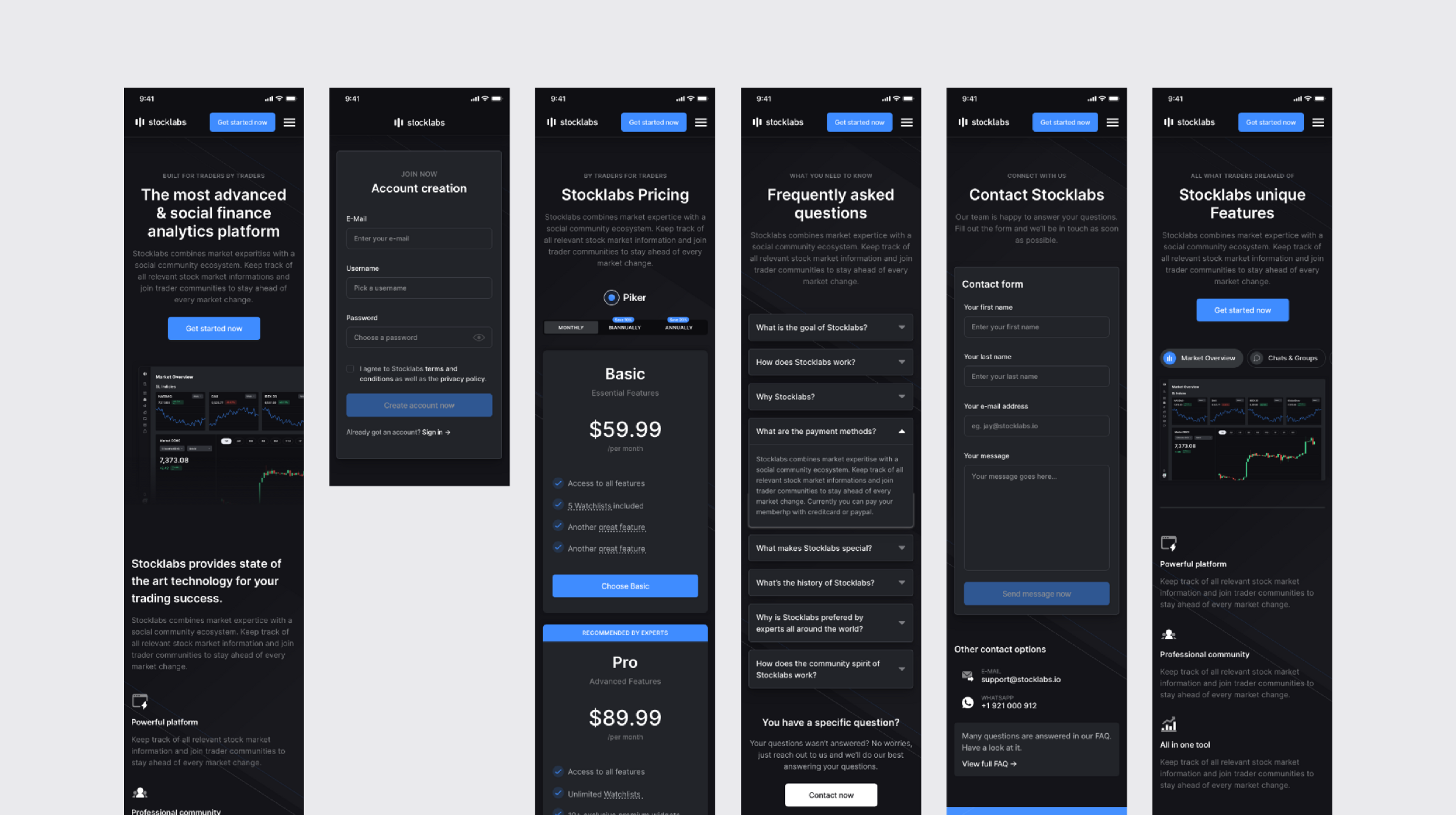
Founded over 10 years, Stocklabs is one of the biggest trading tools to date, offering multiple services and comprising a multitude of valuable features for short-term traders and long-term investors alike. Stocklabs approached us with a request to update their design. We were tasked with the redesign of their entire website, UI/UX improvement, and optimization of their product.
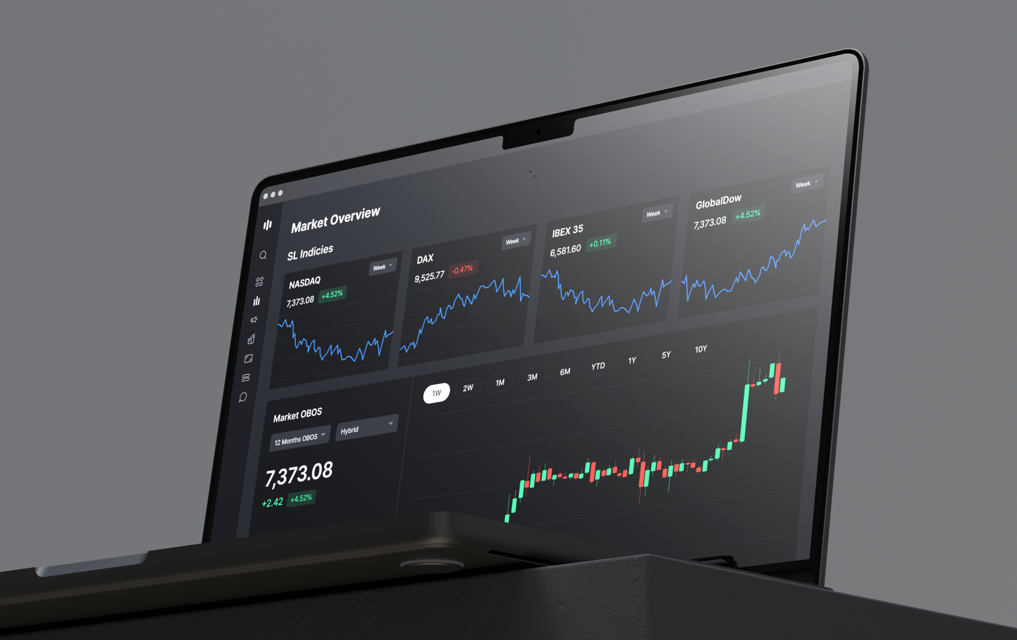
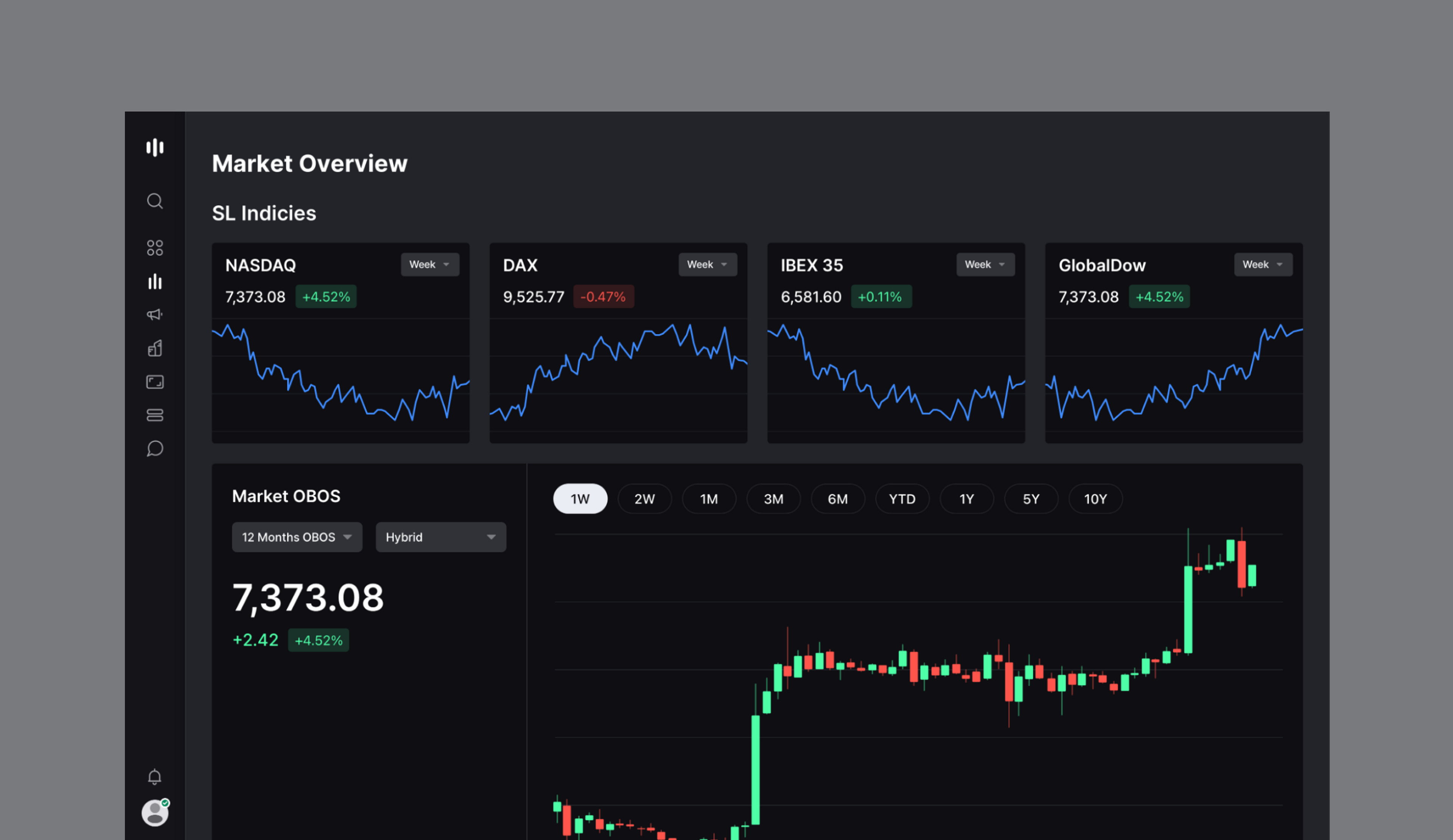
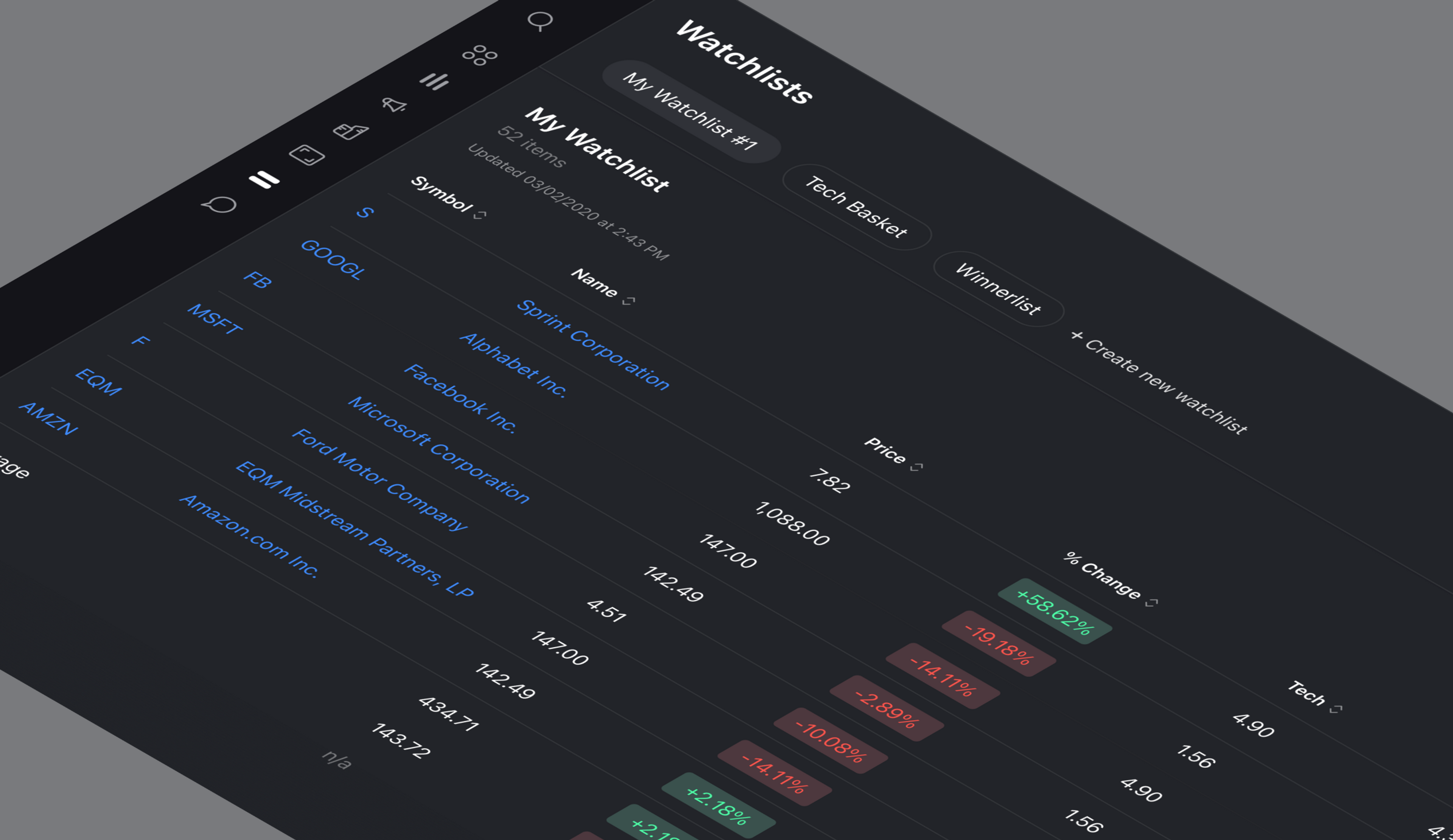
During our discovery phase, we analyzed customer needs and discussed a fitting design approach for the new platform. We quickly decided on what would be the best solution: a minimalistic, clean design. Given that Stocklabs’ supplies its users with a range of information, news, and data on the stock market, it was crucial to display this intelligence in an efficient, easy-to-understand style.
Following this approach, we were able to keep the platform simple and professional, while still highlighting Stocklabs’ unique features. Important data immediately catches the user’s eye through the implementation of vibrant colors.
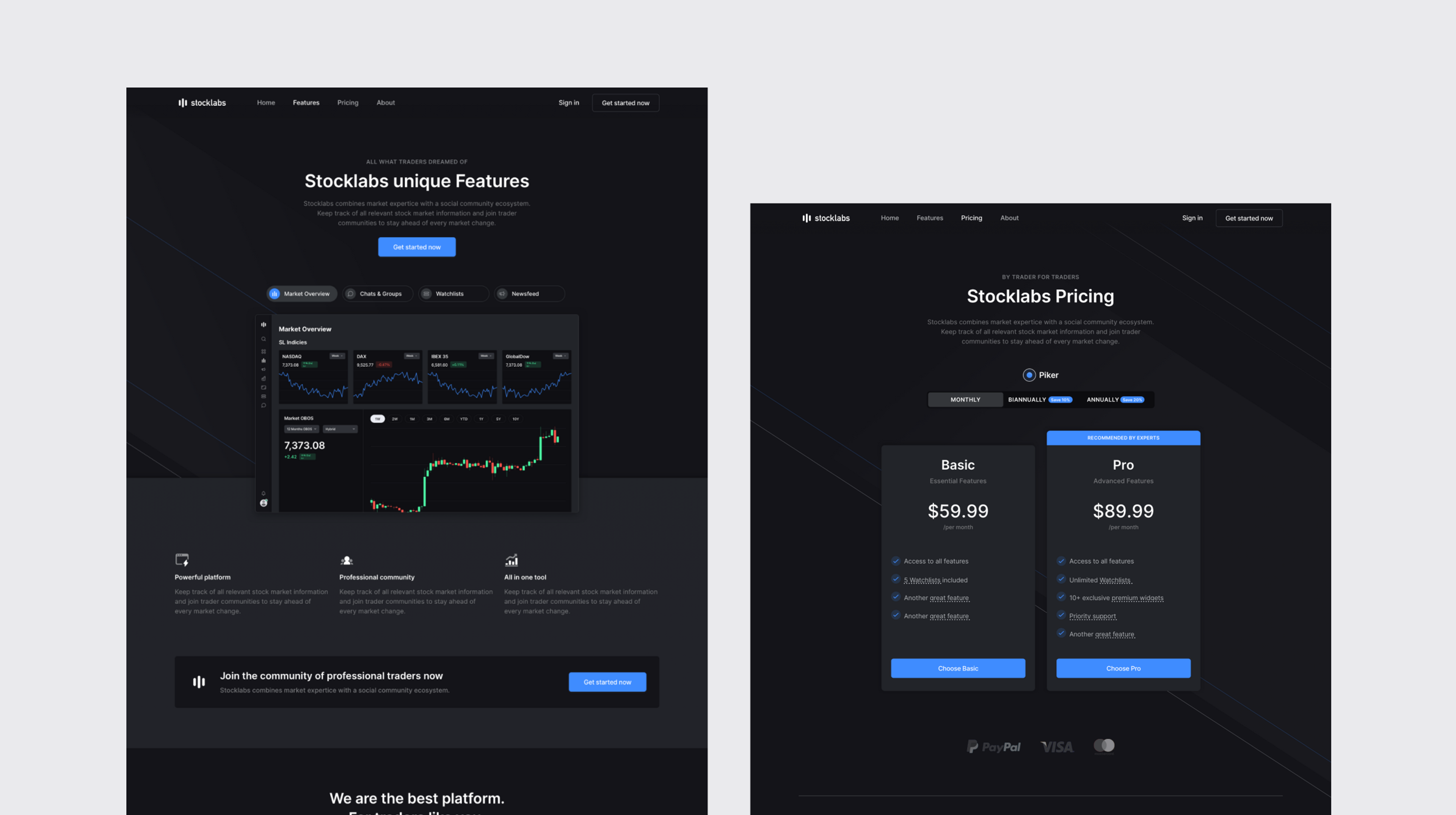
Strong marketing pages
The Result
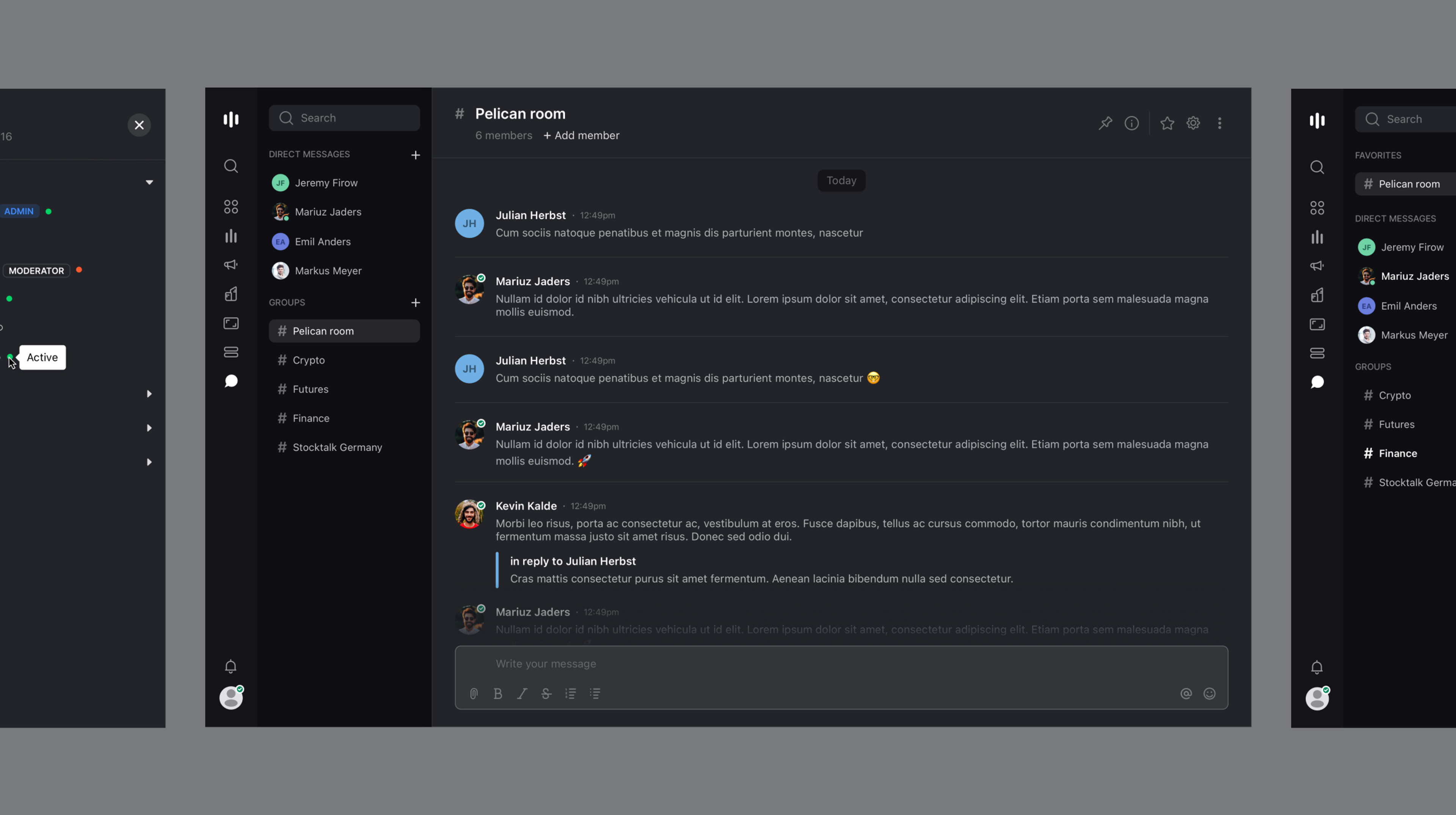
Following 4 months of close collaboration with our client, we successfully launched the new and modernized platform. Leveraging knowledge we gained from numerous past fintech projects, we included sophisticated design approaches to bring Stocklabs’ platform to the next level. We placed the user at the centre of the project, and designed the website to be as intuitive and efficient as possible, ensuring a smooth user flow throughout every feature.
The outcome: a refreshing and professional website design that reflects the unmatched features and services provided by Stocklabs.
